


Let's talk
about space
SpaceX was established in 2002 with a vision to revolutionize space technology, and by 2018 they plan to launch a rocket to Mars, and thereafter, aim to achieve manned missions to the planet (or planets). SpaceX is know for its pioneering spirit, but lesser known is the company's hidden sense of humour.
Being in a highly specialised sector, the company can seem alienating and not very relatable to the general public. The fact that SpaceX is doing ground-breaking work for the future of the human race, makes it essential for the common people to identify with the brand and take an interest in its progress. This is possible when the outward appearance of the company is made friendly, interesting and engaging.
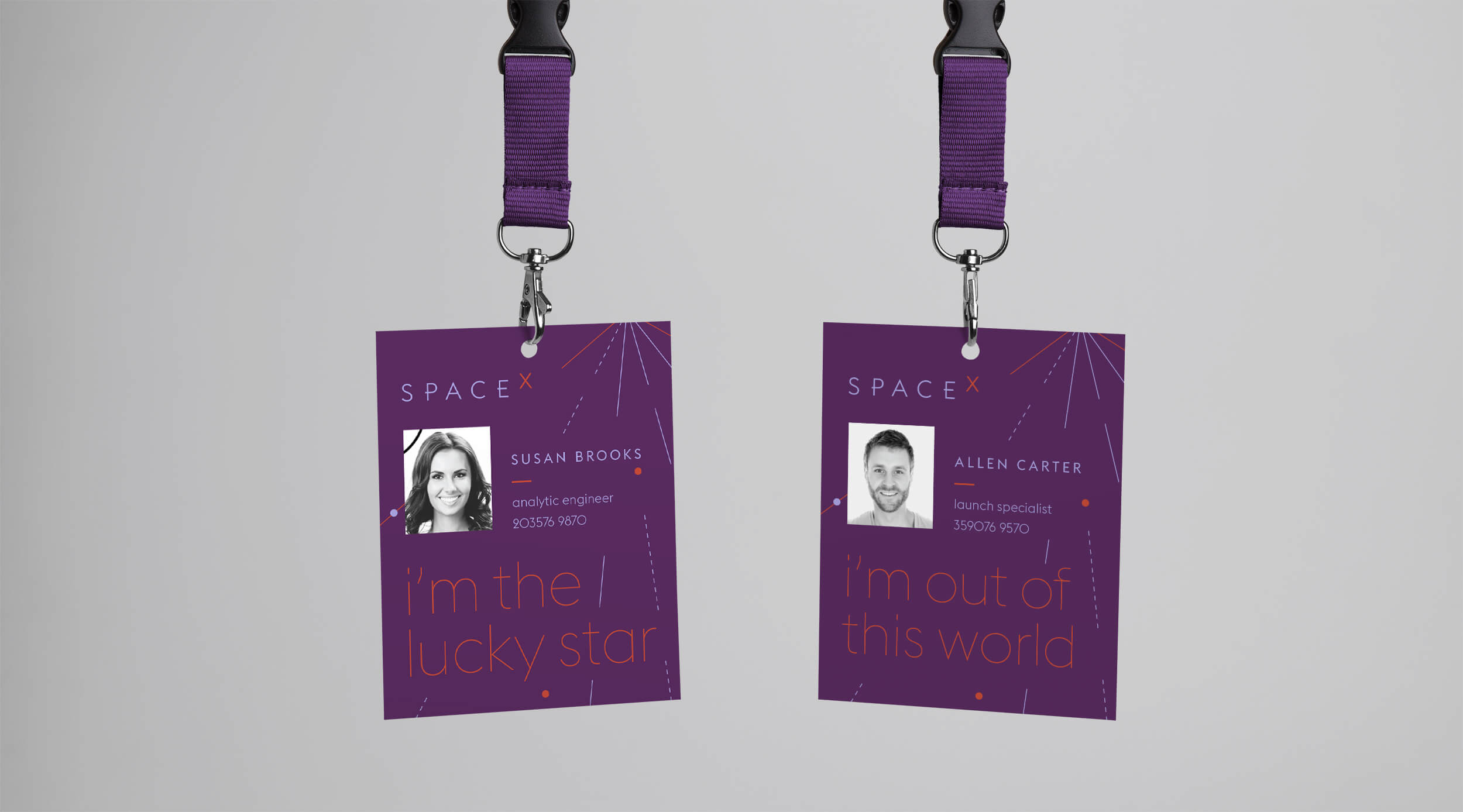
The aim of this re-branding is not only to bring out their core values and vision, but also to highlight its sense of humor, to make the company seem more fun and approachable.


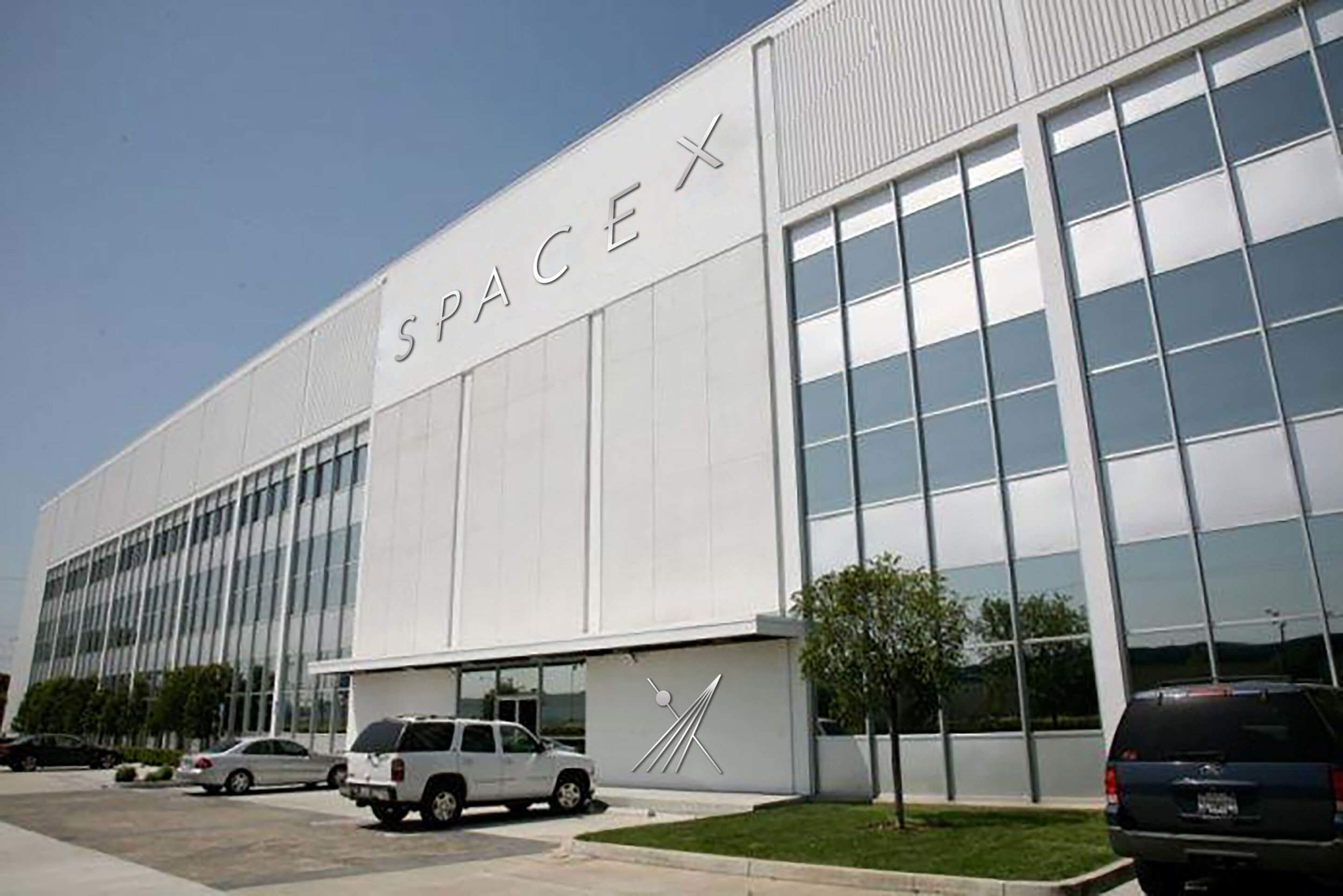
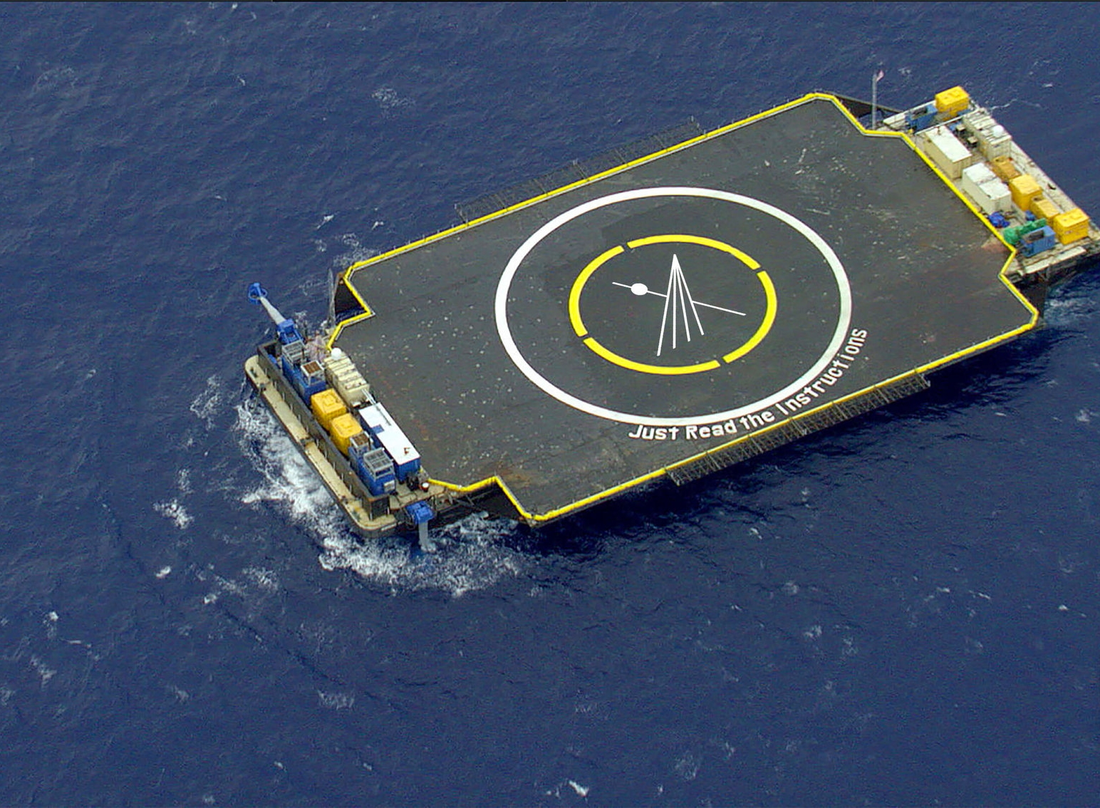
The visual language
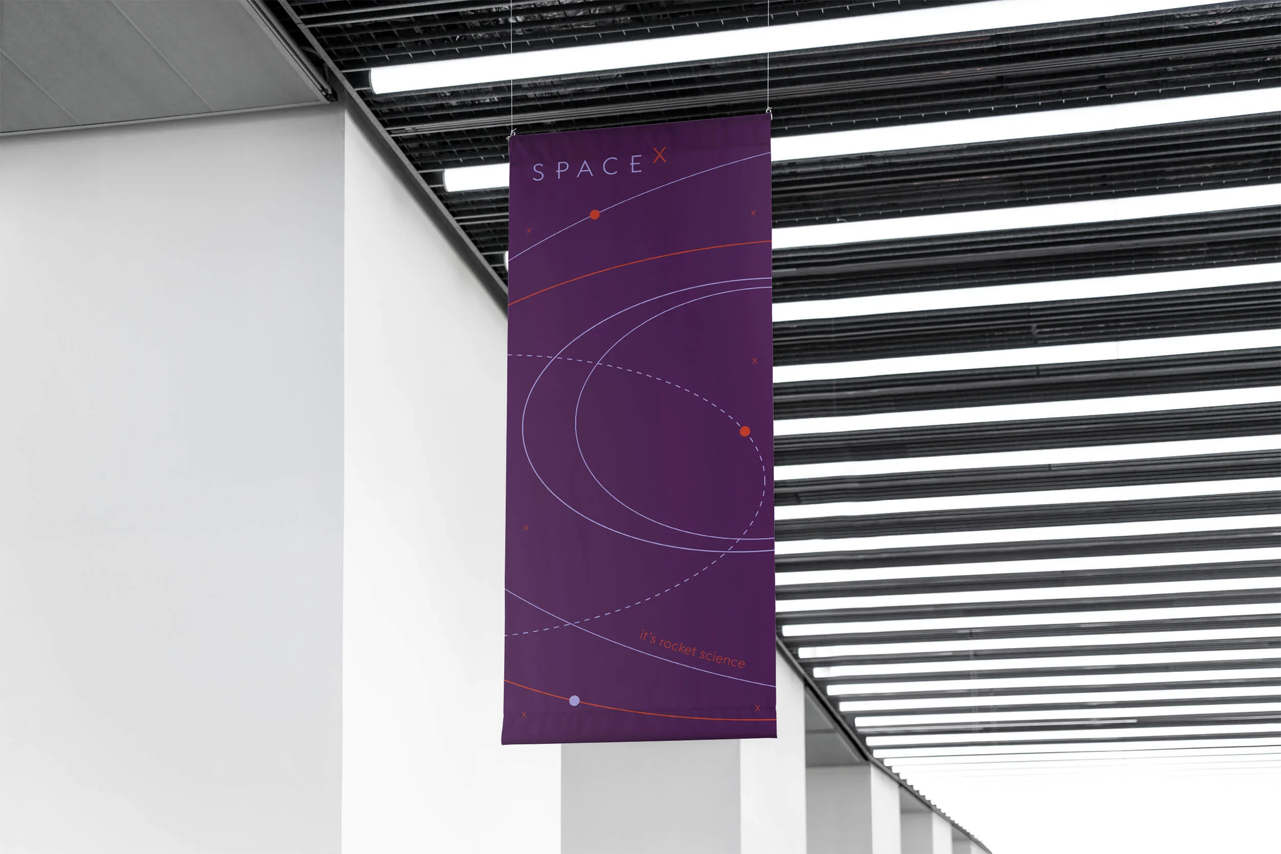
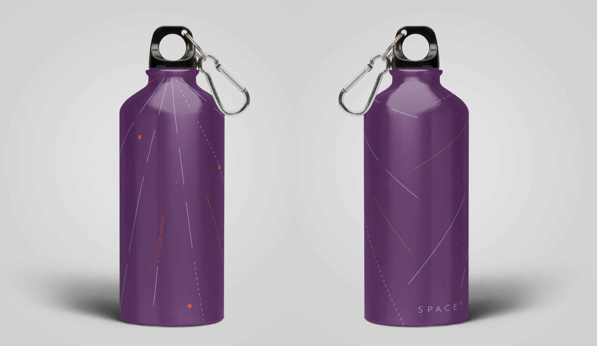
The visual language of the brand is inspired by motion, rocket launches & trajectory, orbits and speed. The challenge was to show these in a way that was not technical, but as graphics that look visually pleasing and fun. Using simple lines and strokes combined with smaller elements from the logo, that can be understood by a common person, forms the graphic palette of the brand.


Brand's tone
of voice
The messaging system of the brand has been developed in a way that it highlights the humorous side of SpaceX, making the company sound ‘seriously fun’. The system uses commonly used phrases in their literal context. This is in conjunction with the tagline — ‘it’s rocket science’. The visual language put together with the tone of voice, helps create a unique universe of SpaceX.


Images Courtesy Pintrest


This project was designed at Rhode Island School of Design, Summer 2017, instructed by Donald Tarallo.