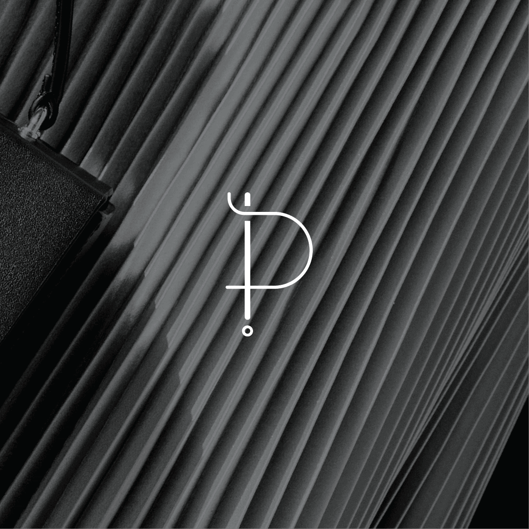


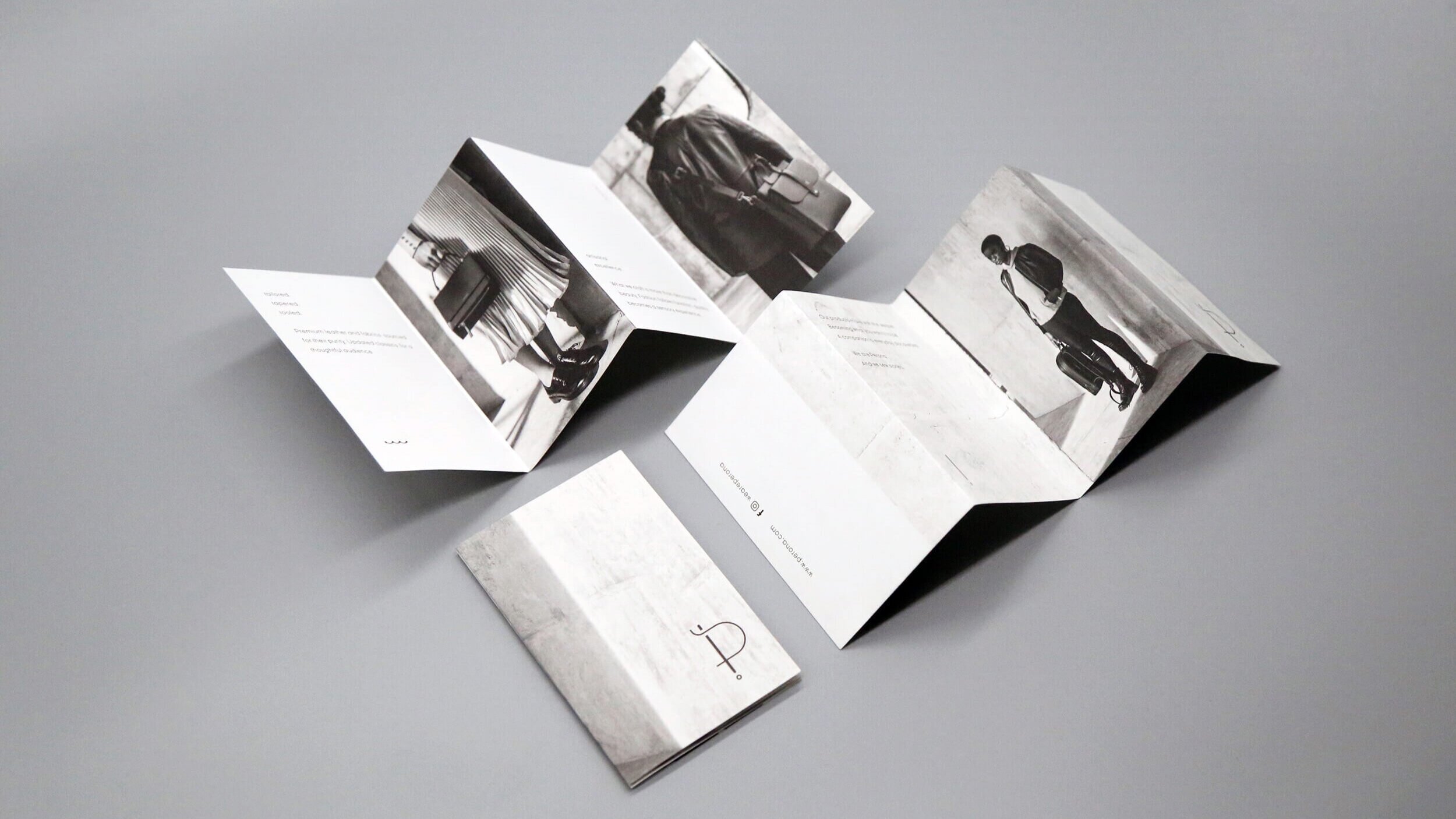
Sewing
the story
www.perona.com
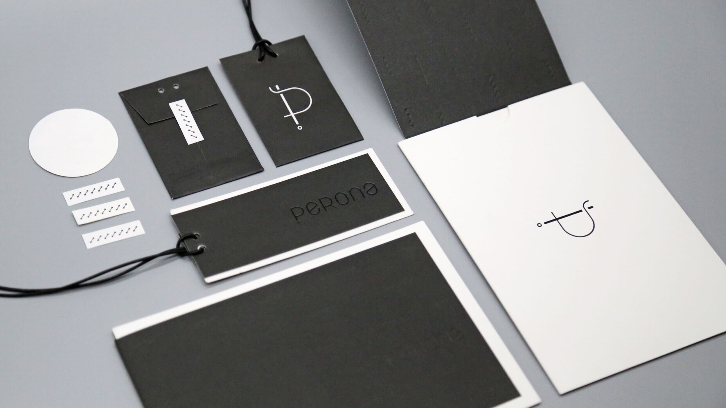
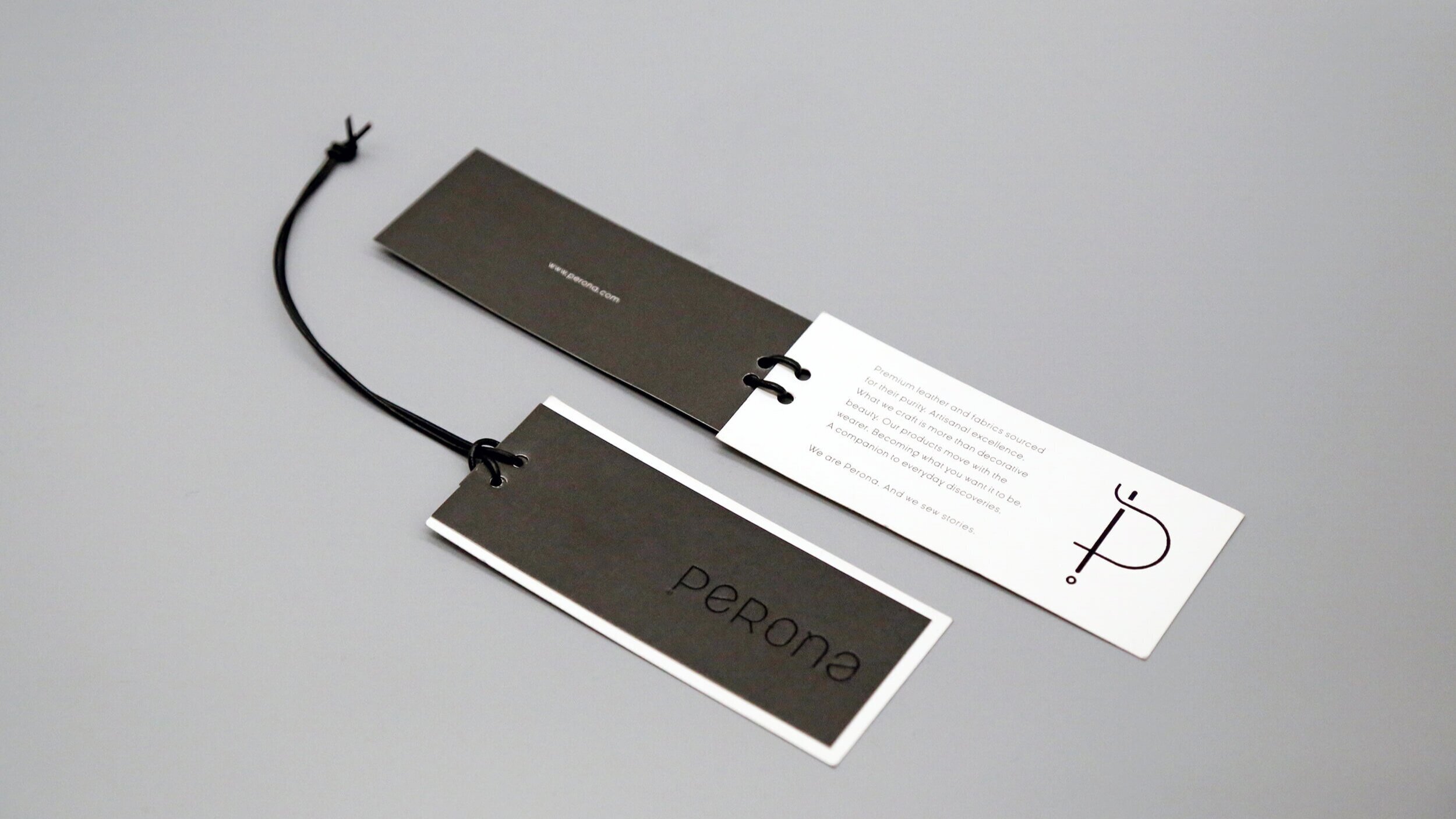
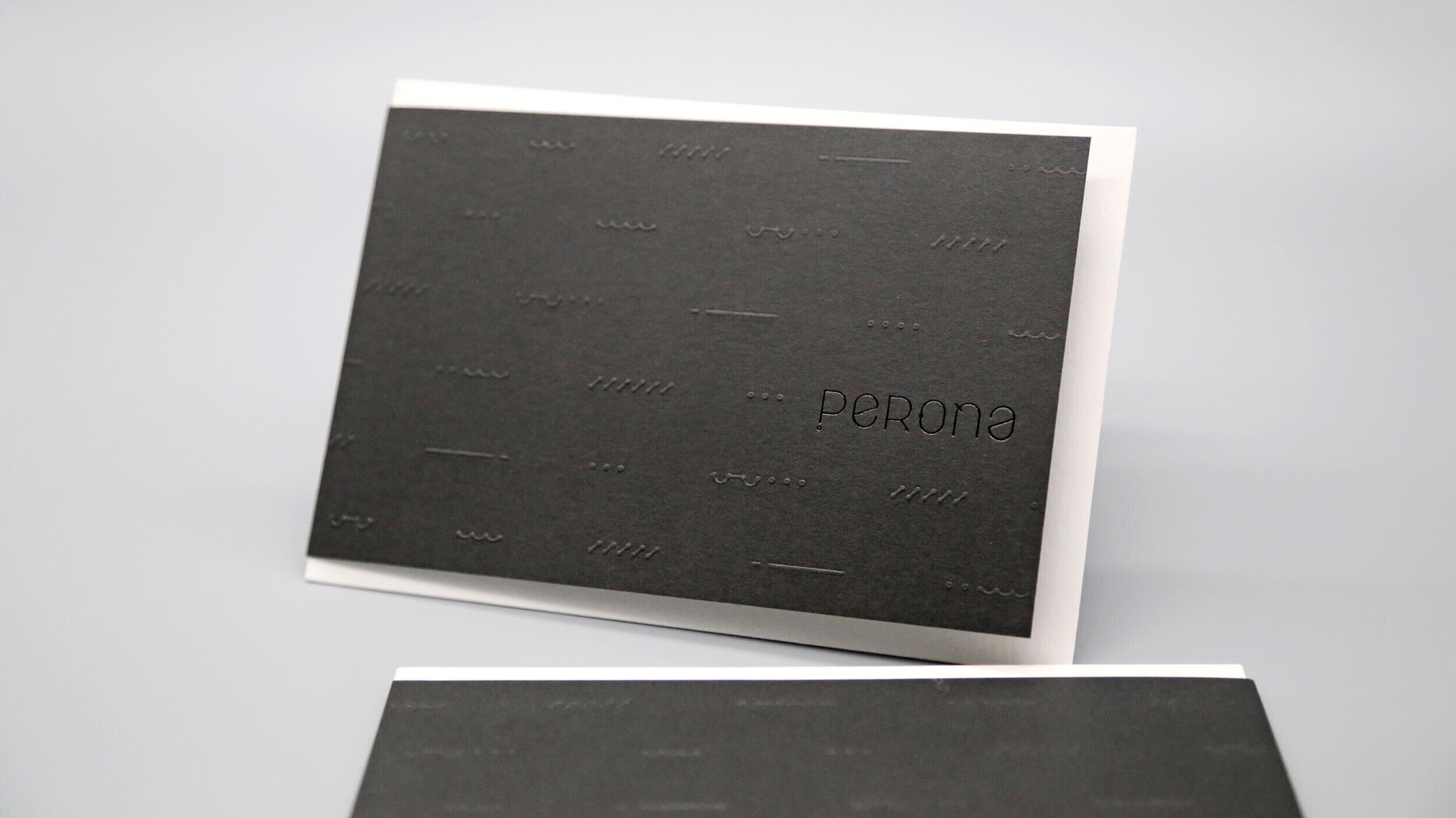
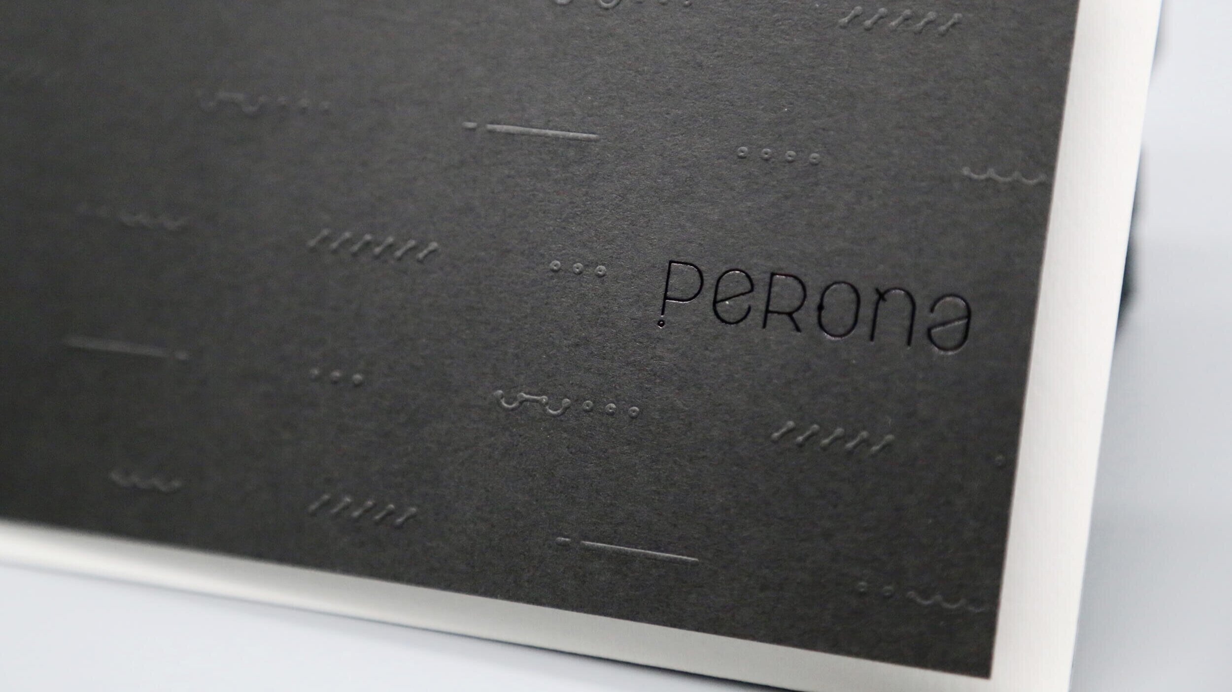
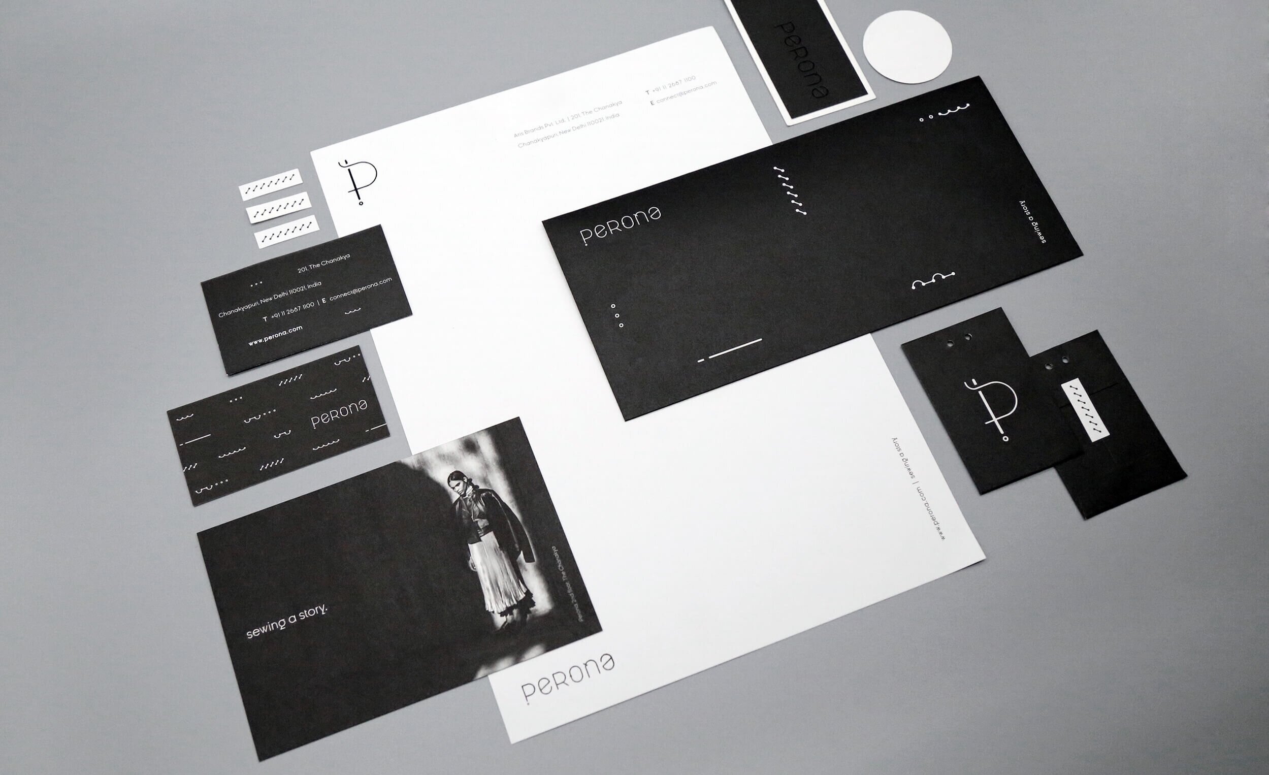
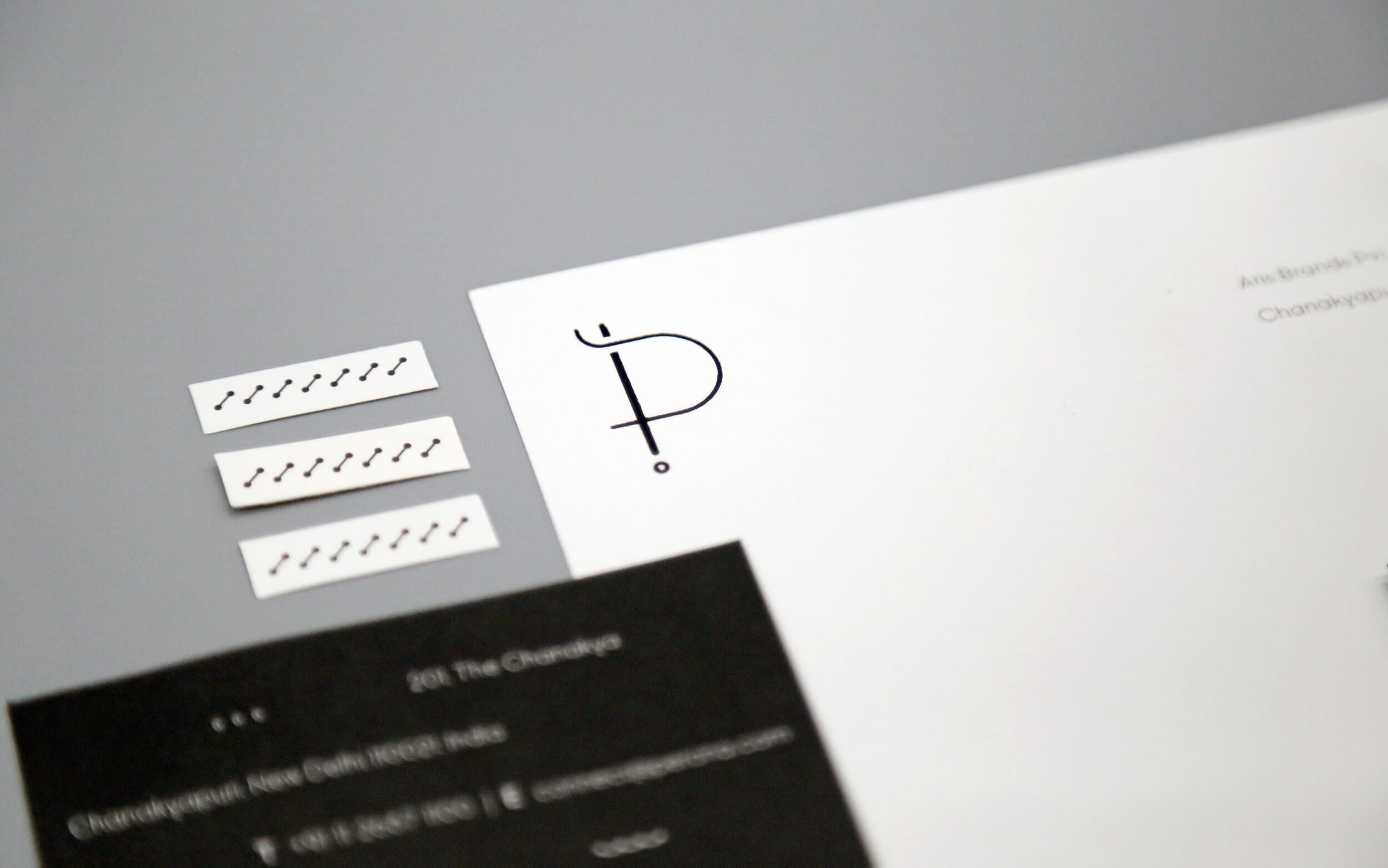
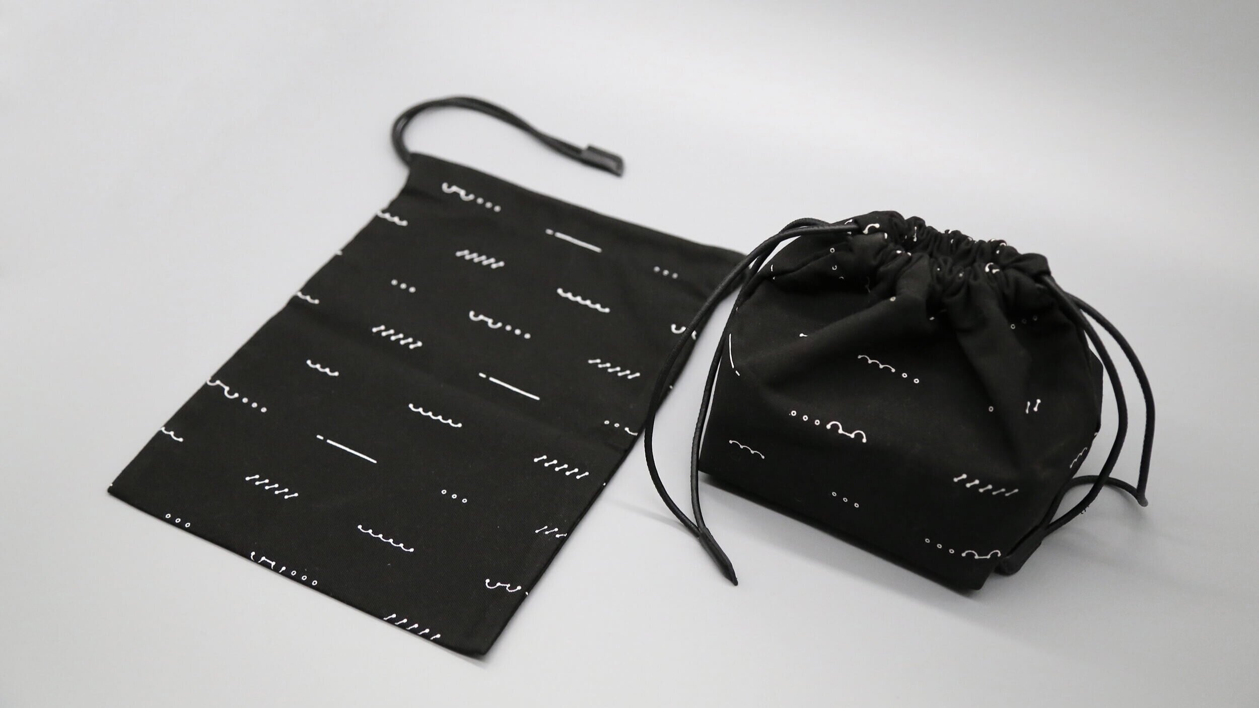
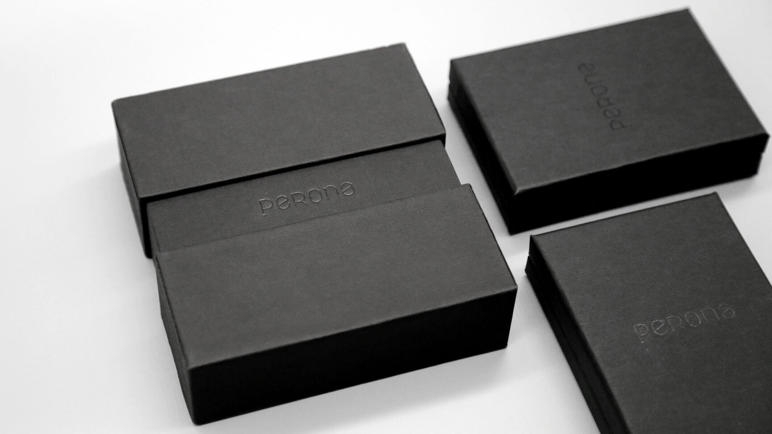
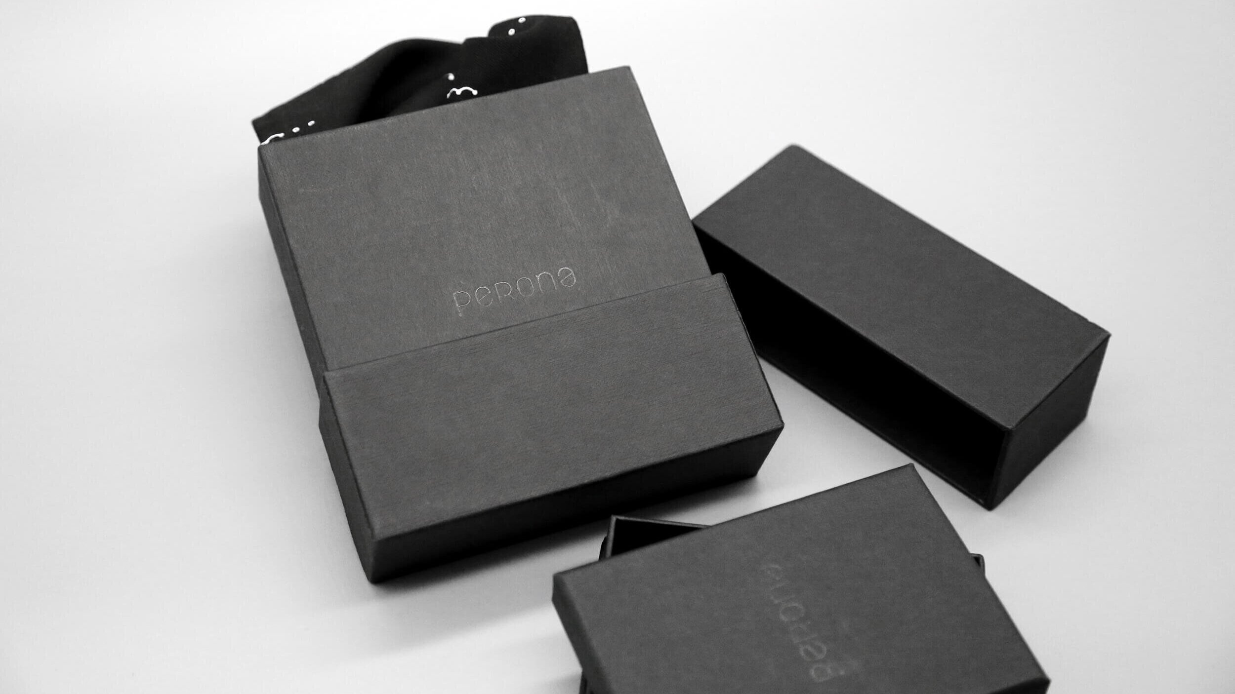
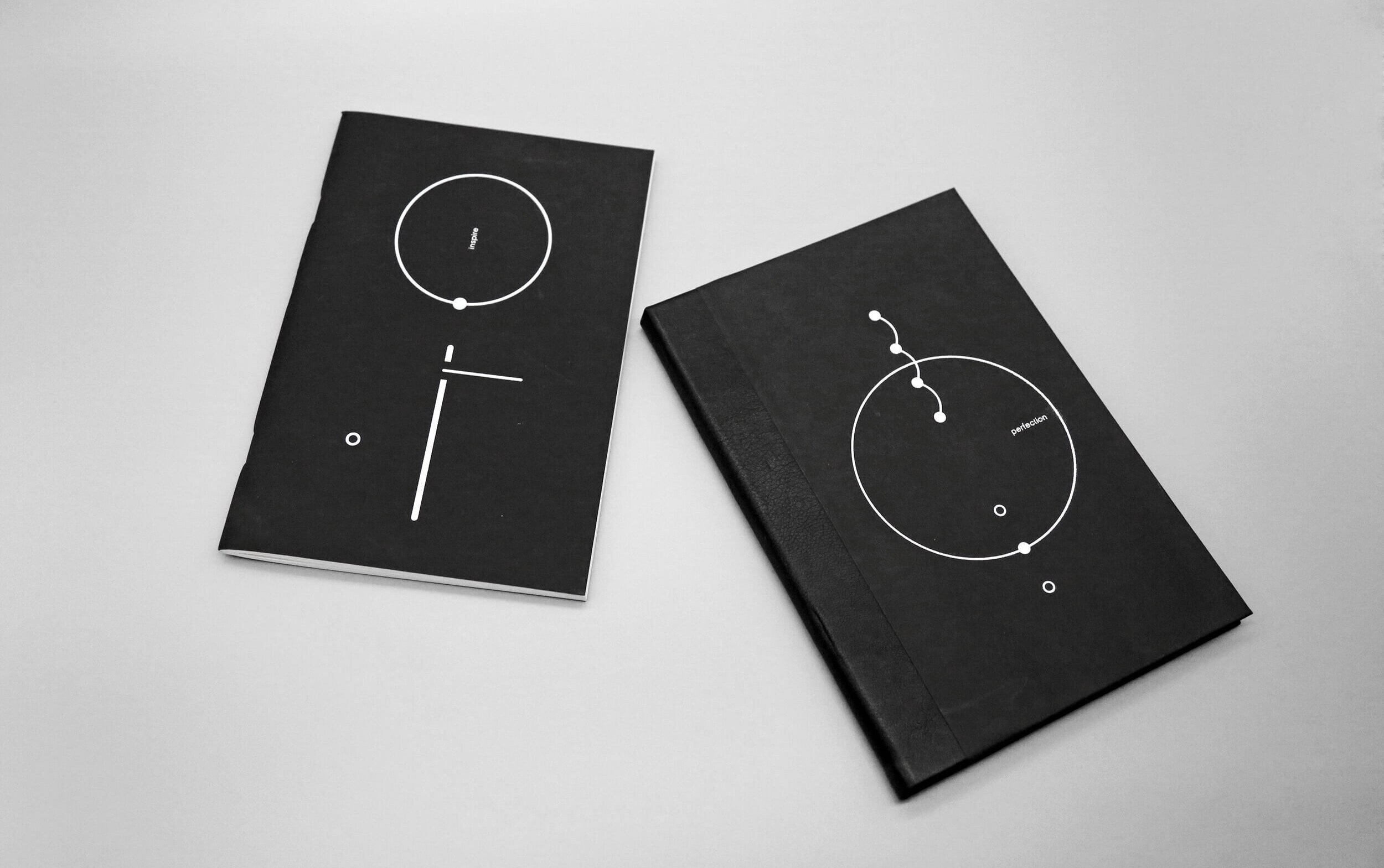
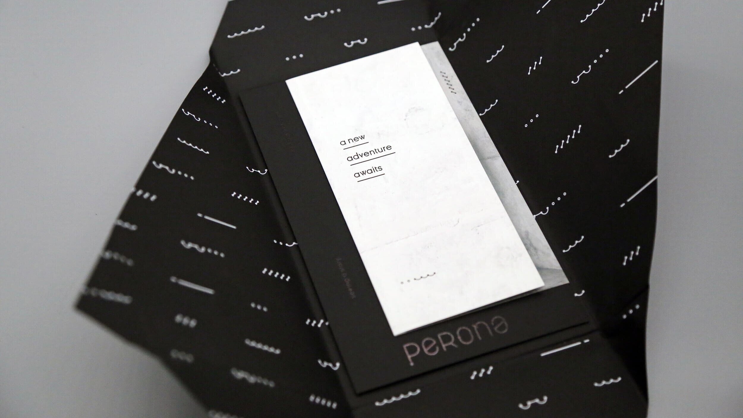
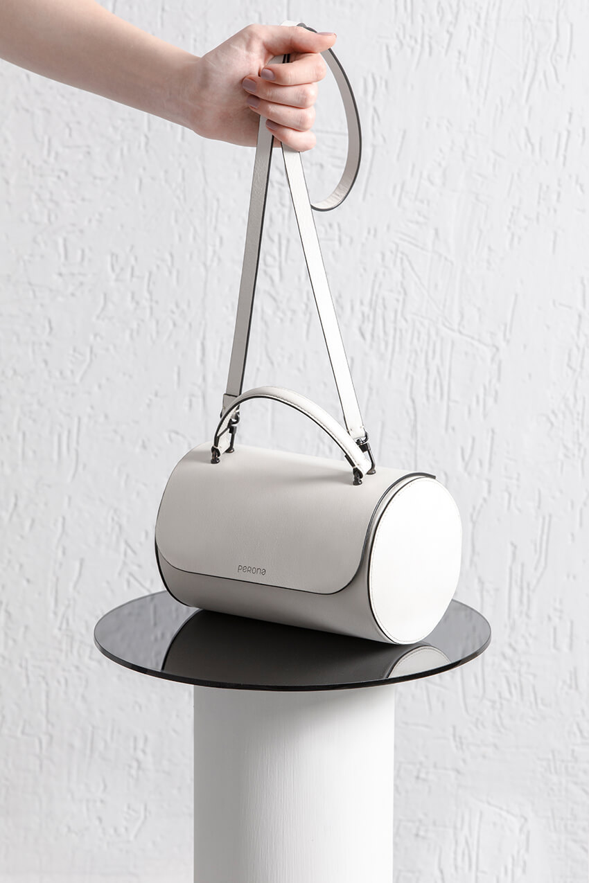
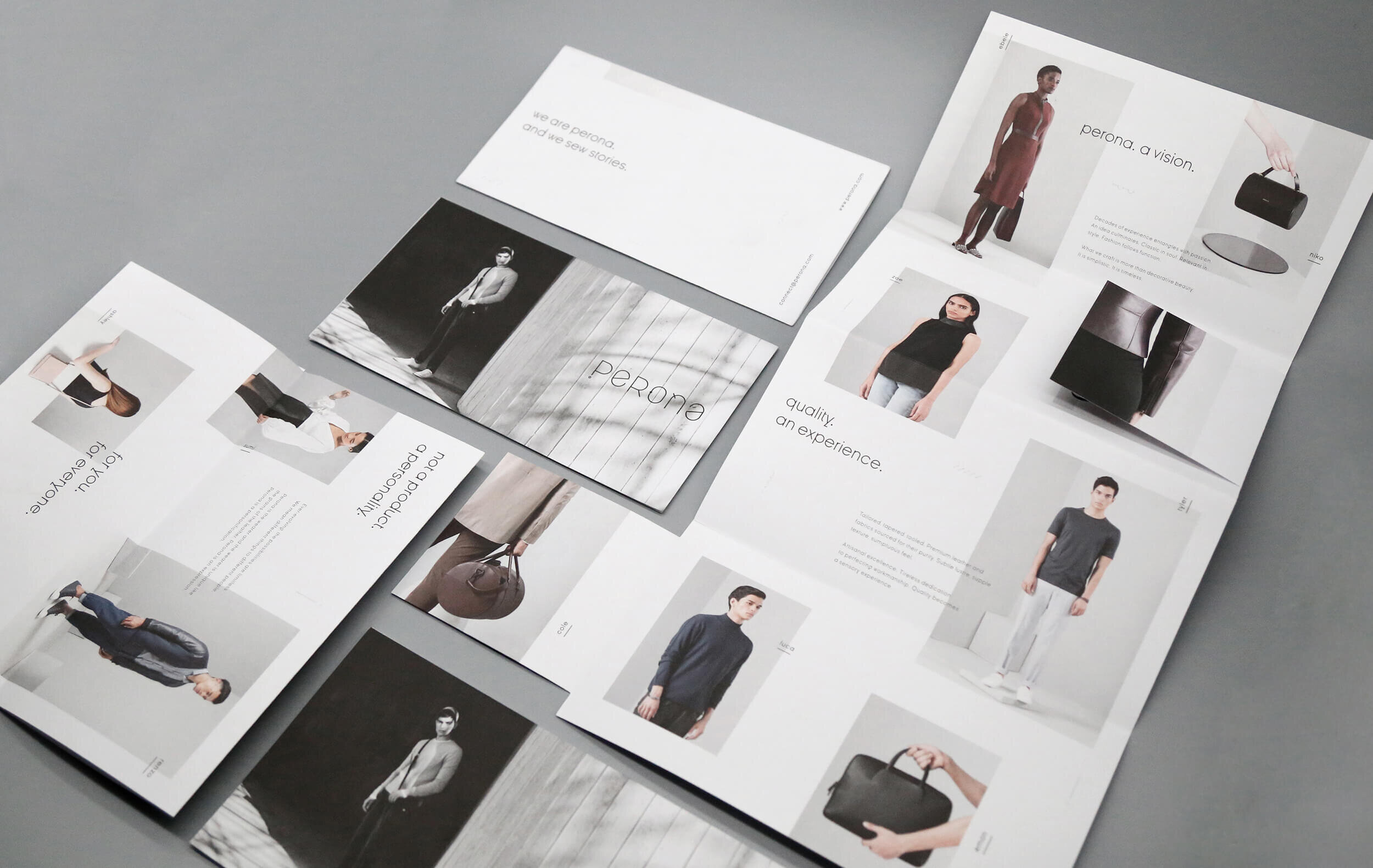
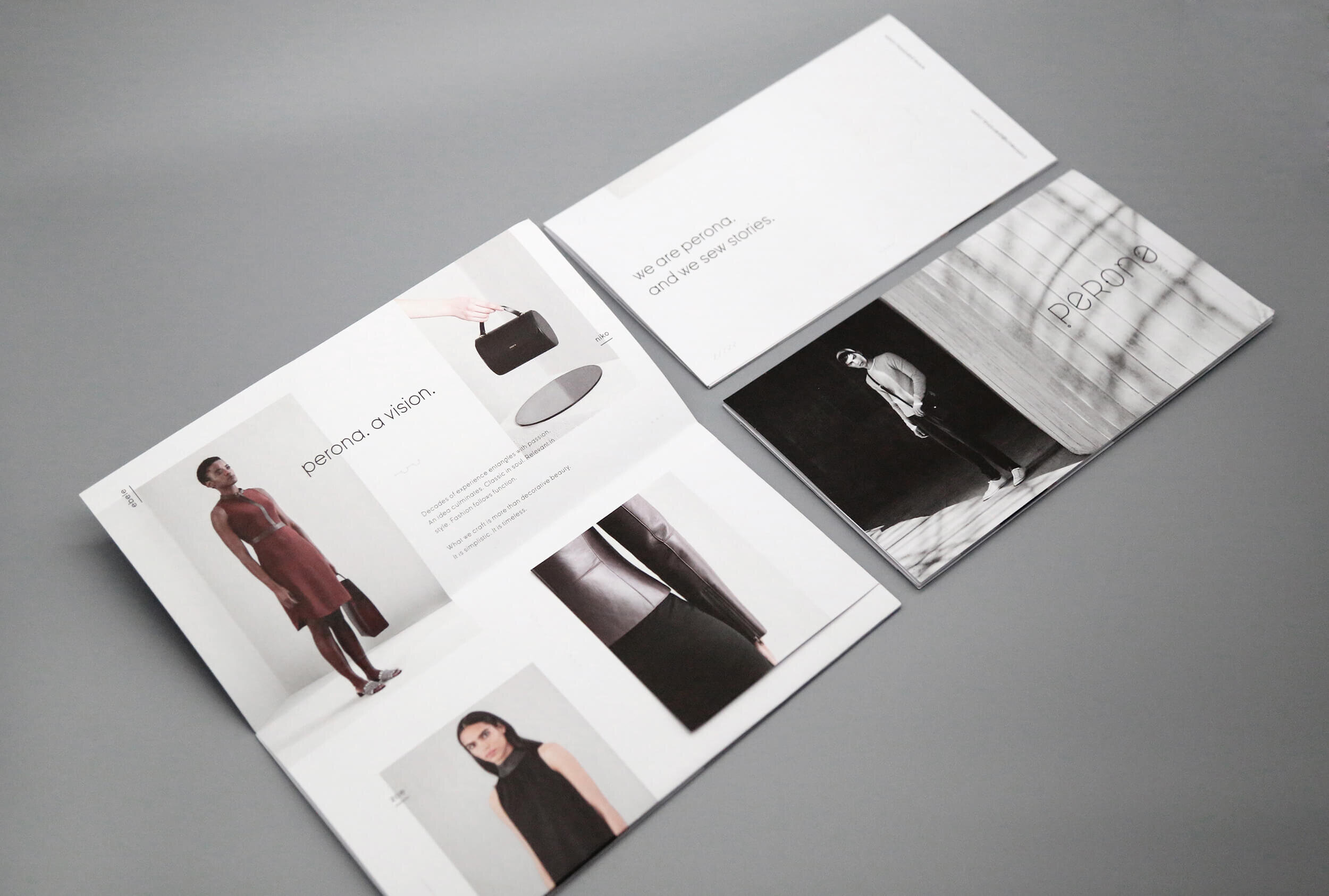
Perona is a premium fashion brand, with a clean and minimal aesthetic. The identity of Perona starts with the brand pillar ‘Modern Minimalism’. The inspiration behind the identity is reflected in the brand name itself ‘Perona’, which means ‘sewing’. The main strength of the brand lies in the skill and craft of leather, and therefore it became an essential part of the concept.
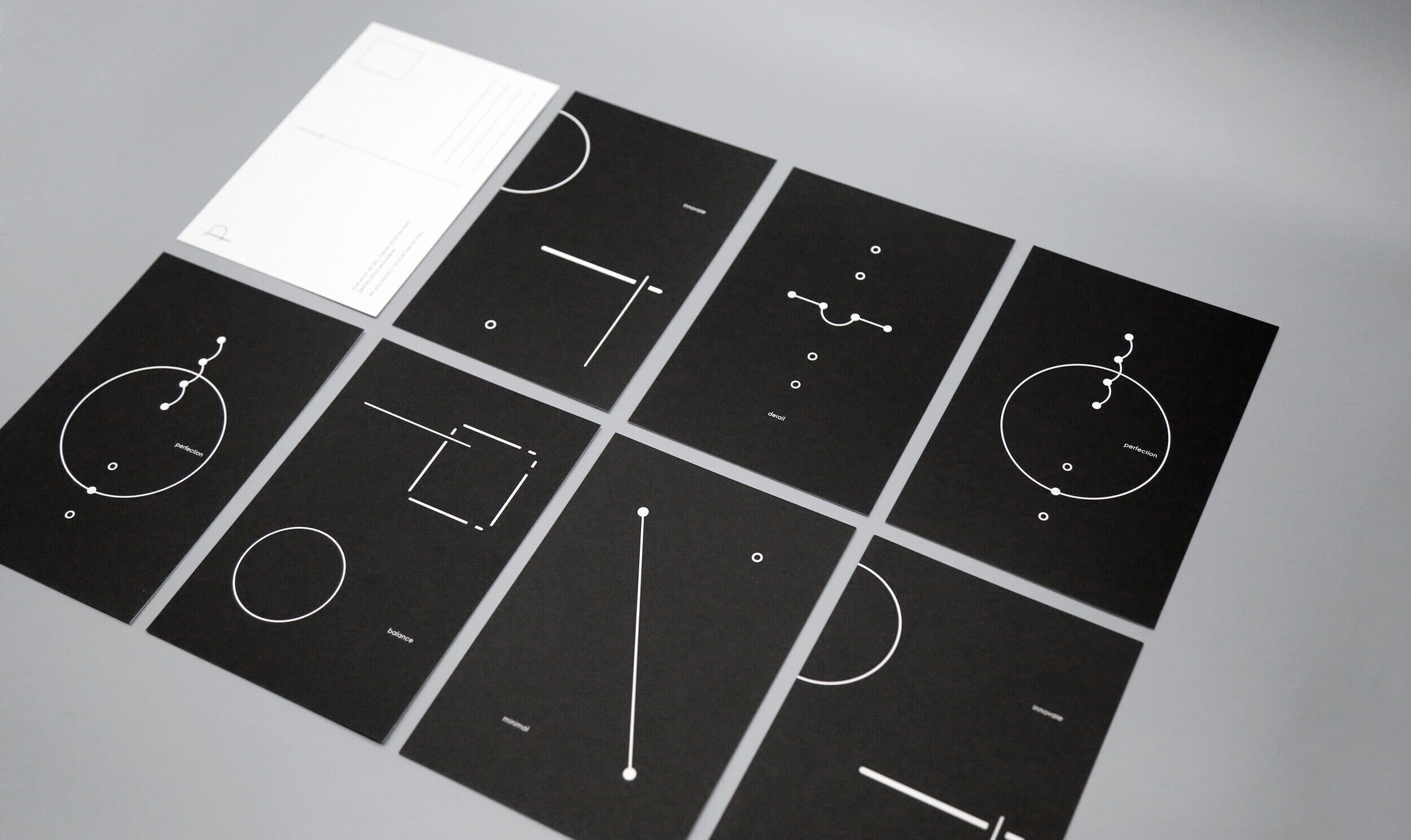
The custom type developed, resembles the fluidity of the thread and the mark is a modern, stylised rendition of the needle piercing through the thread, which is a classic way of sewing leather.
Featured on www.brandsawesome.com / This project was done while working with Illum Design / Content by Nasreen Singh


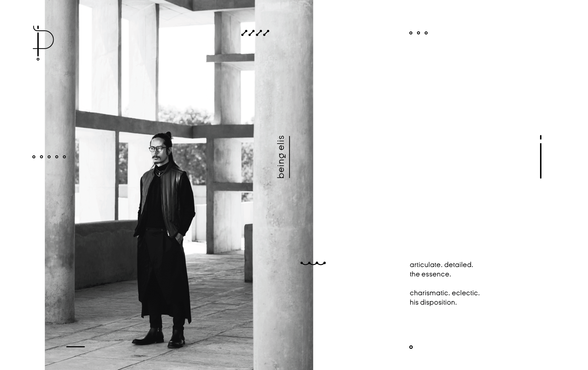
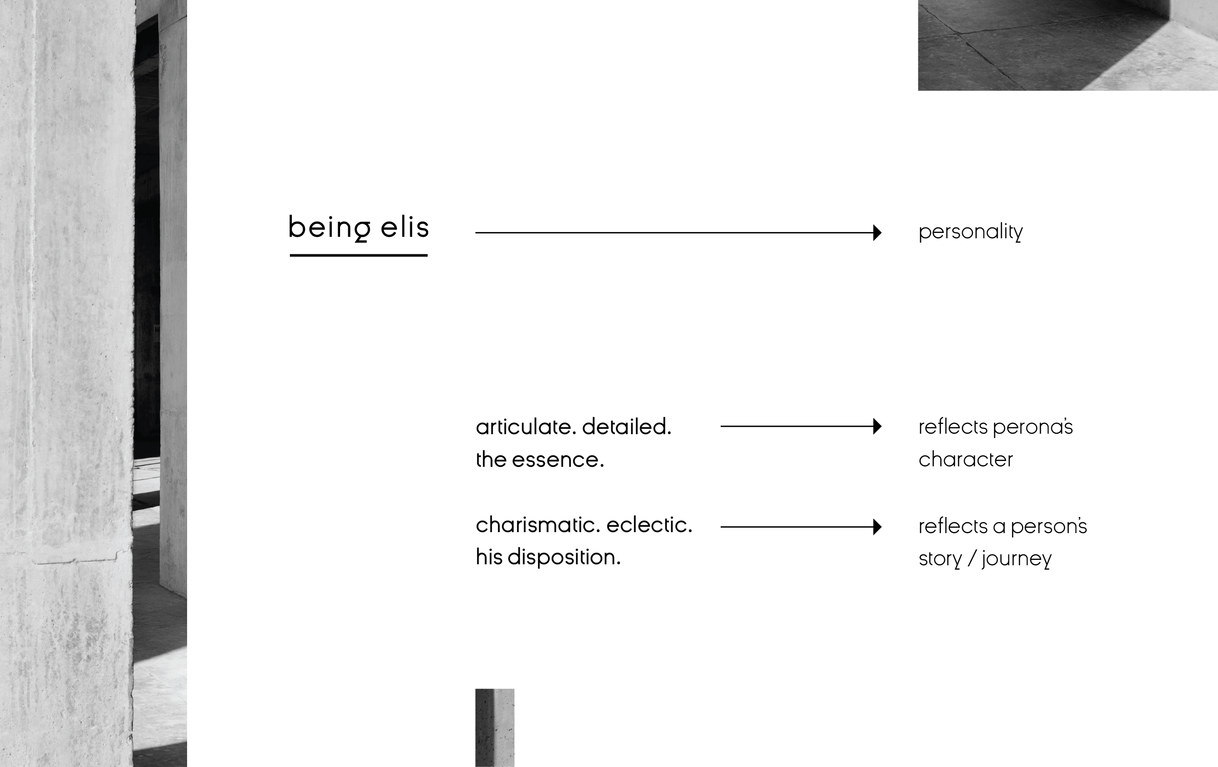
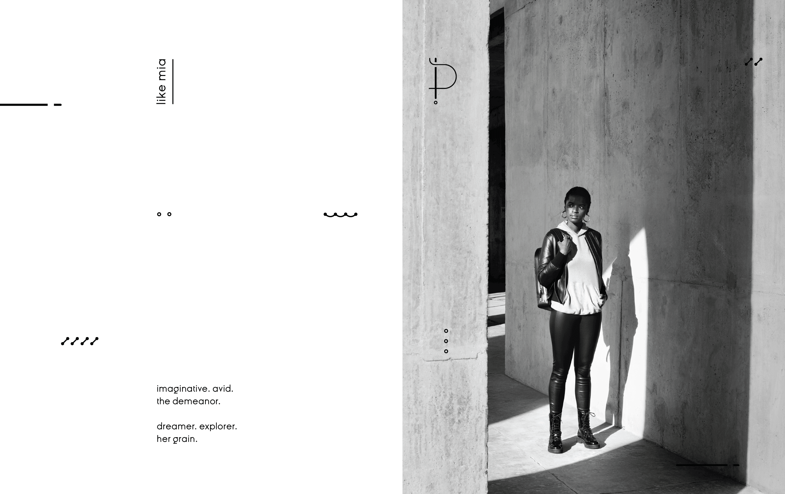
Imagery &
tone of voice
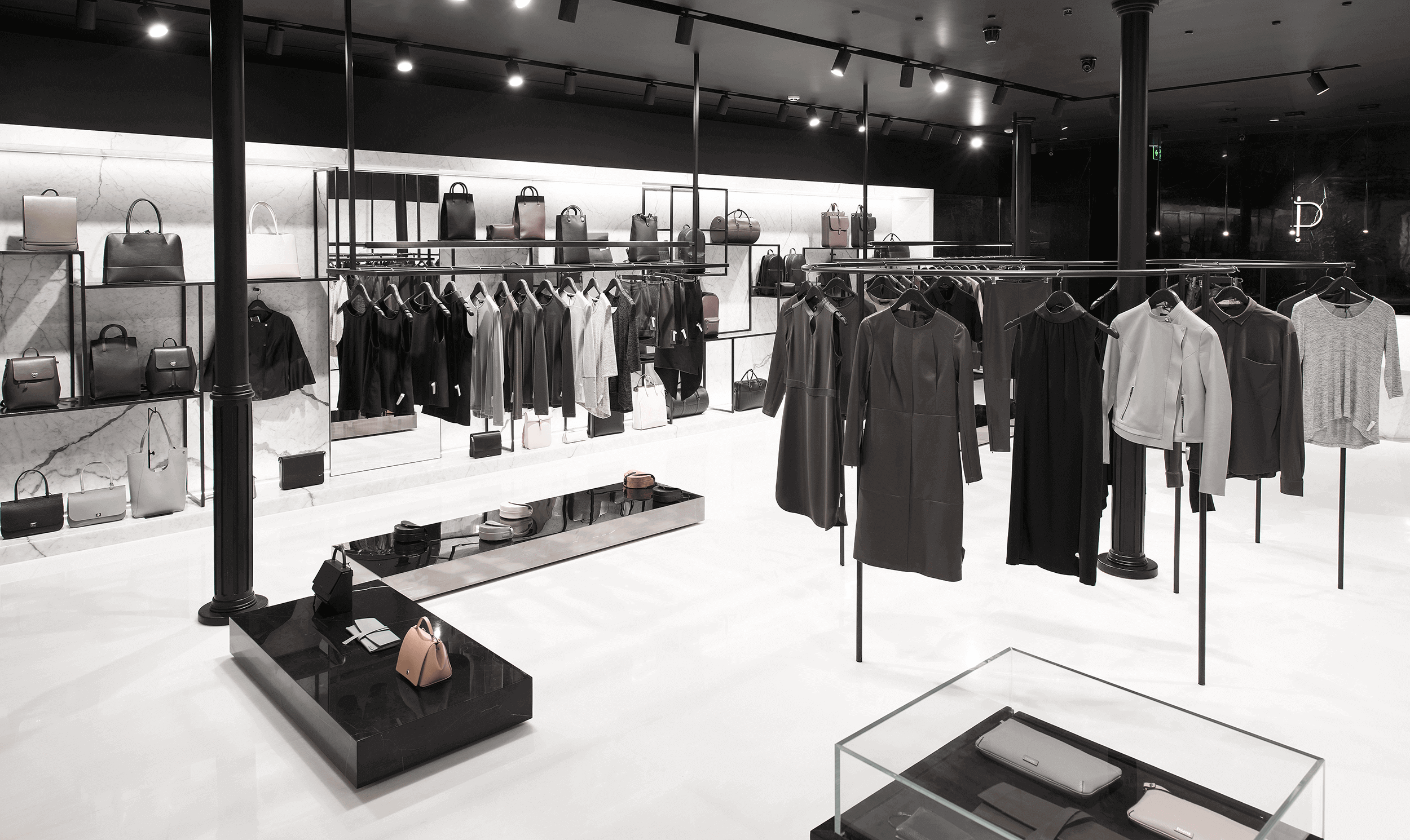
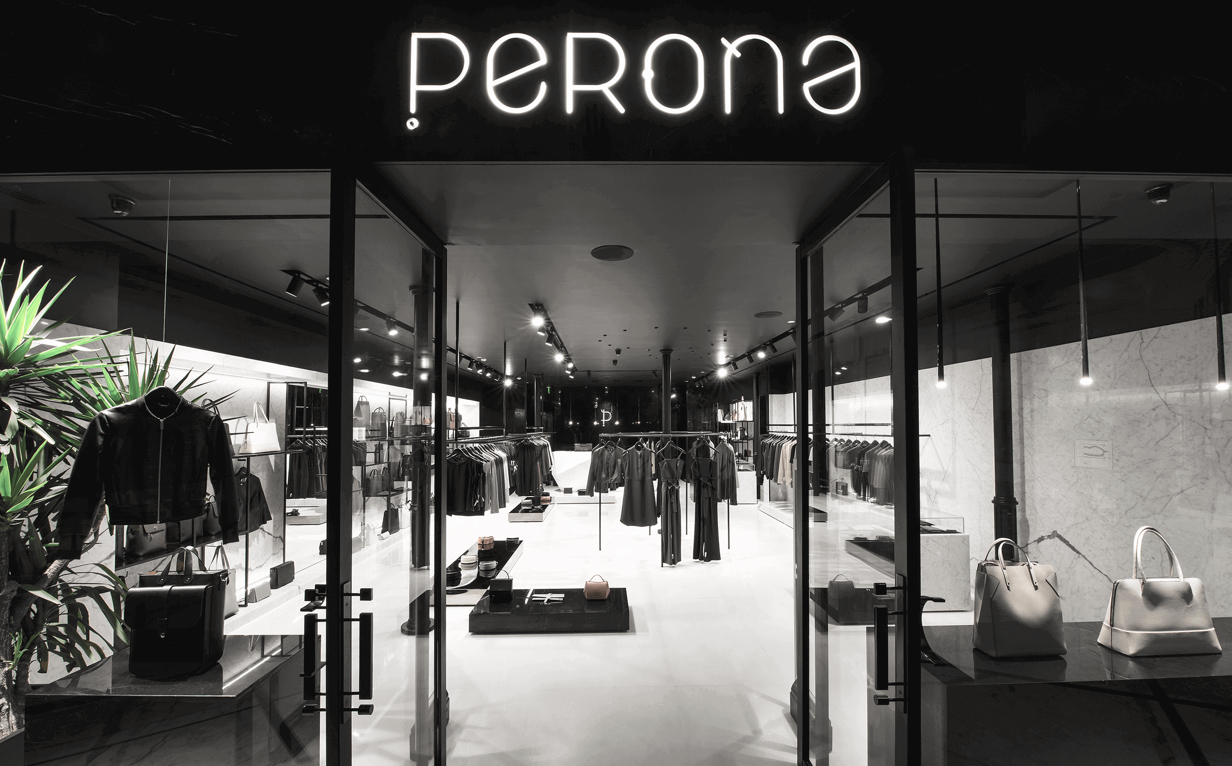
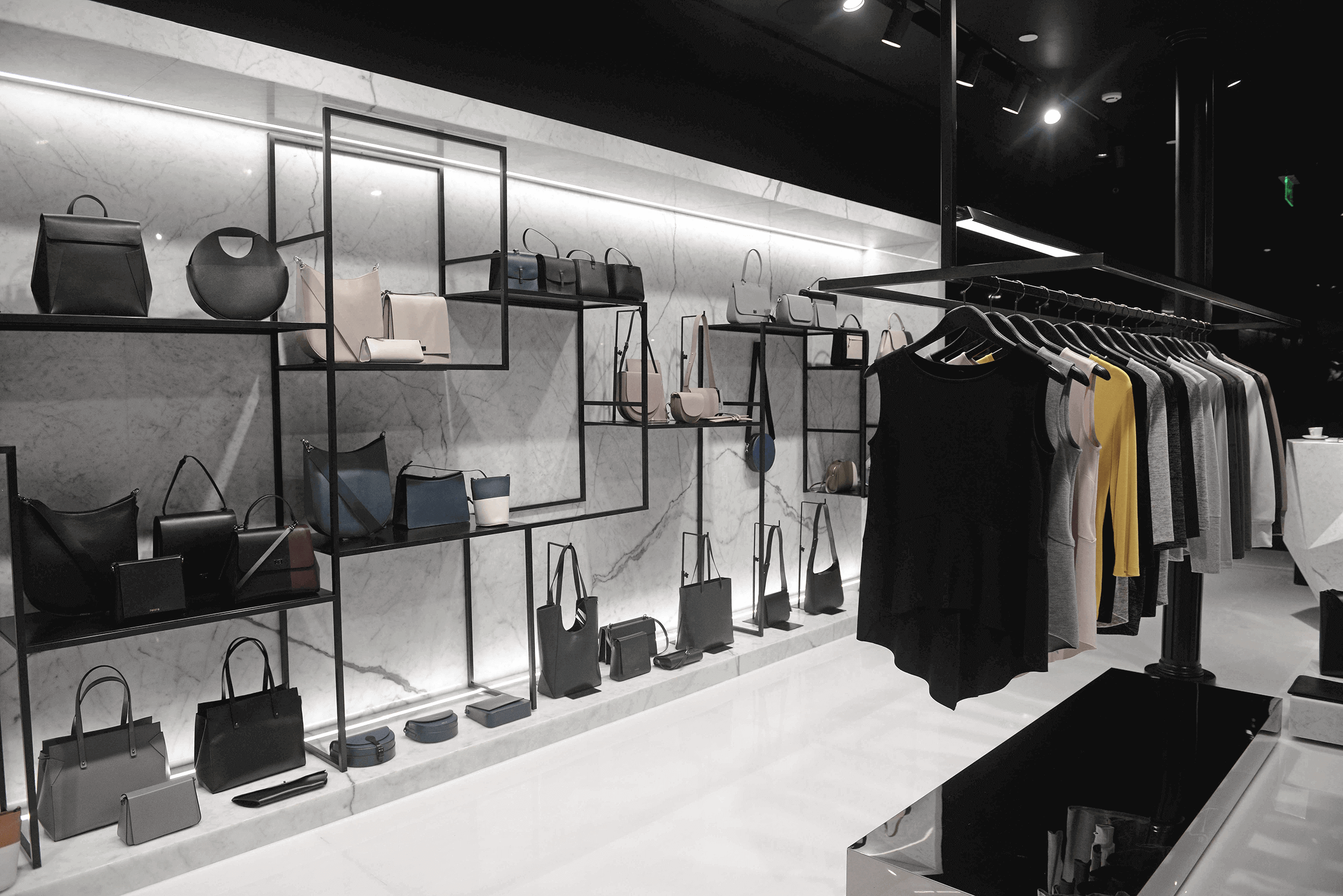
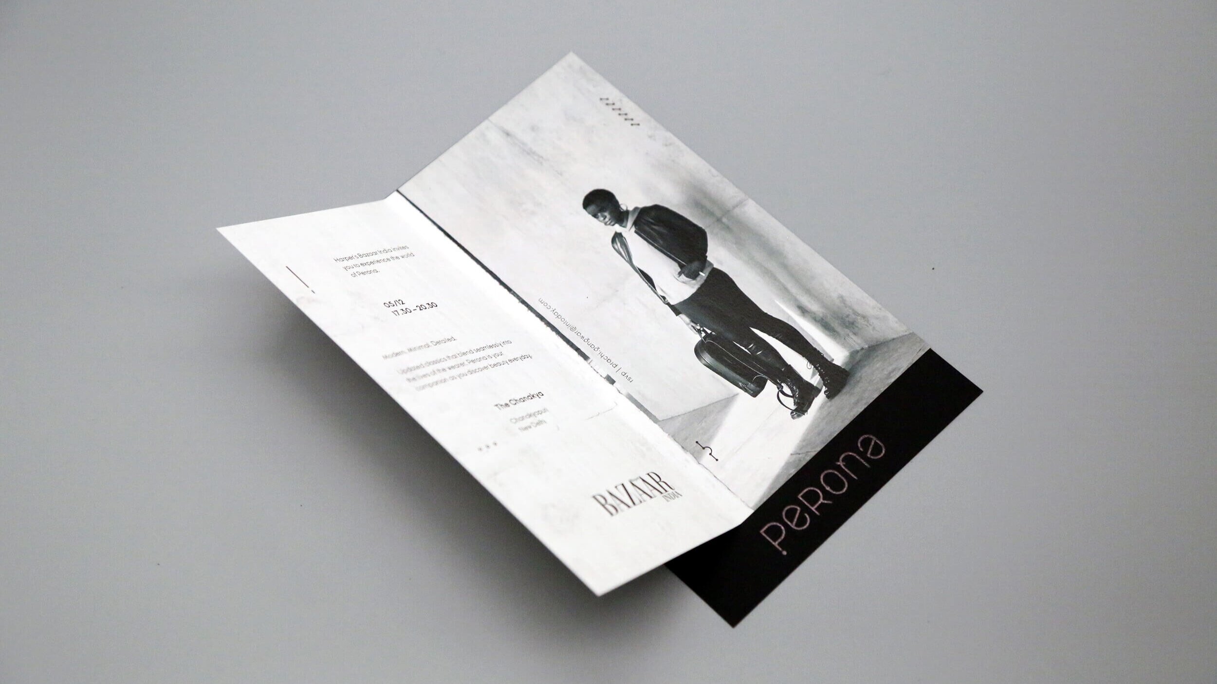
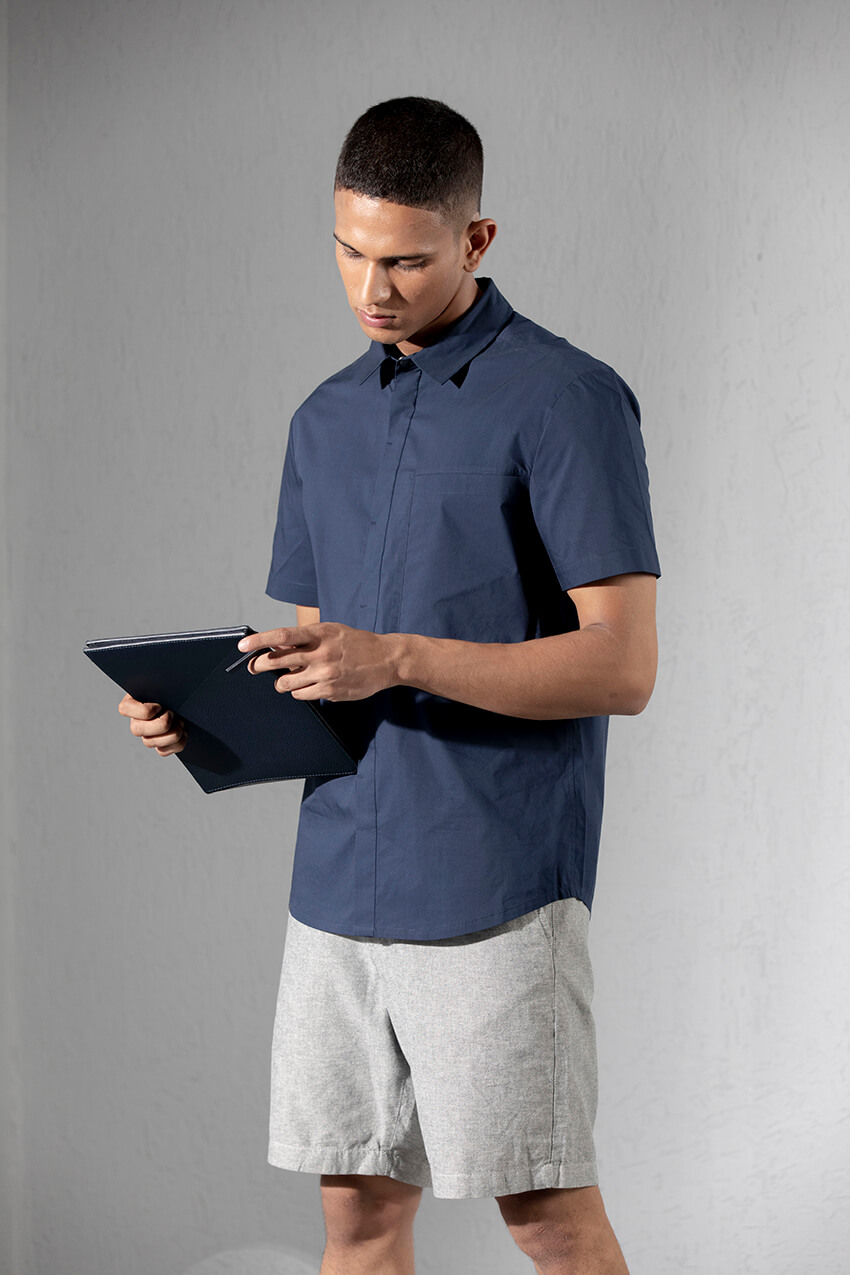
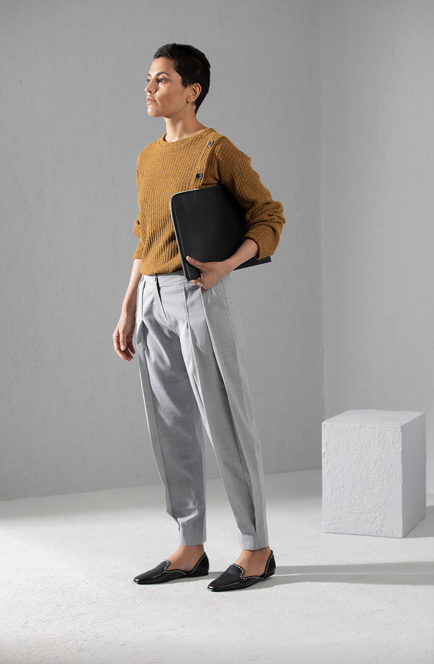
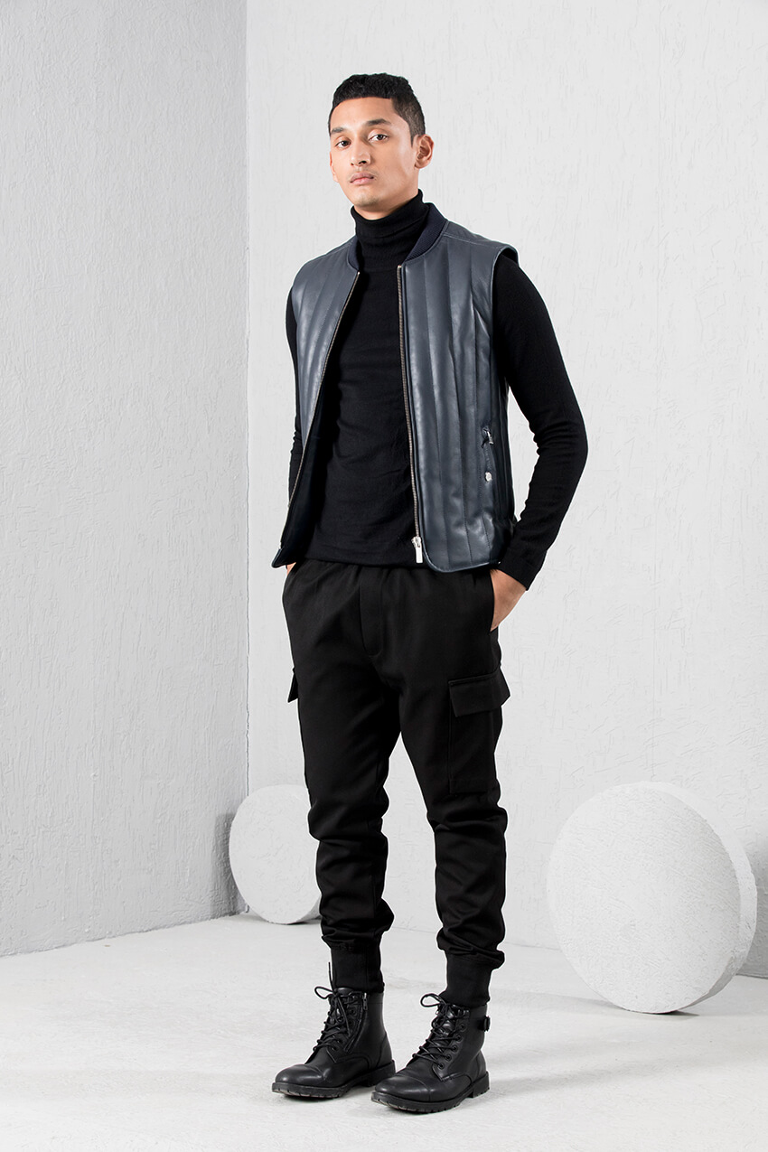
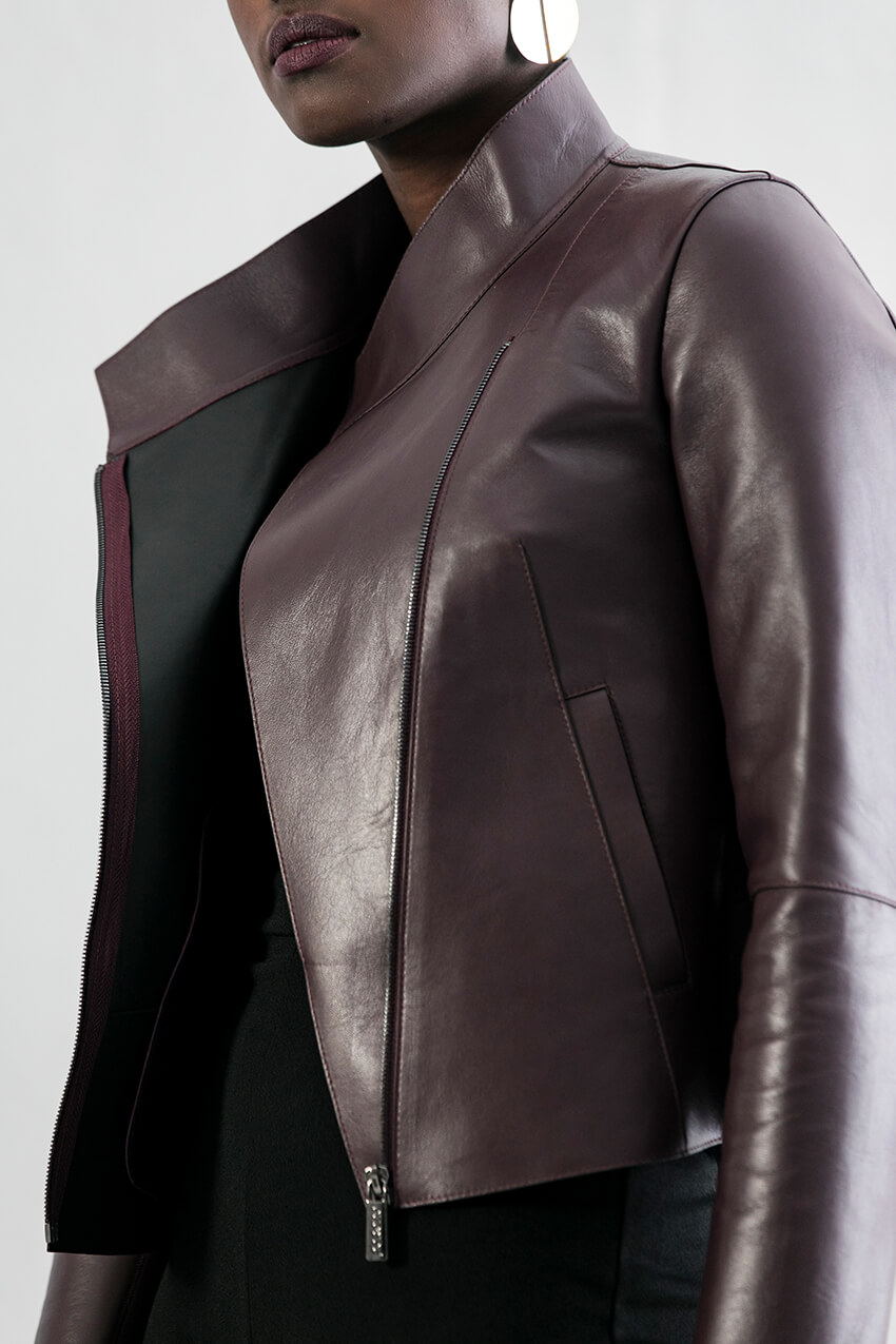
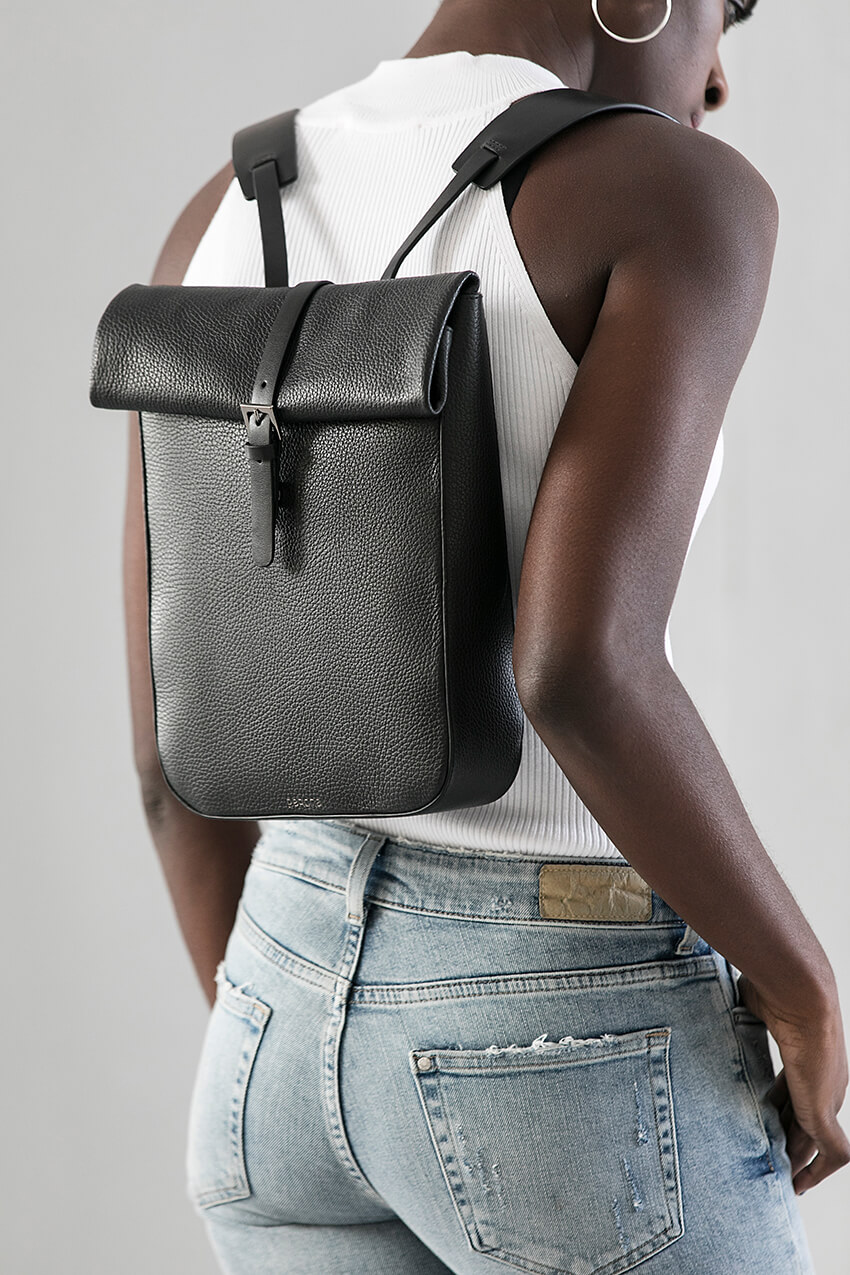
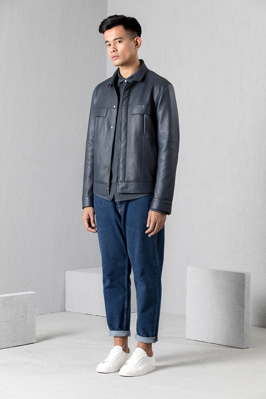
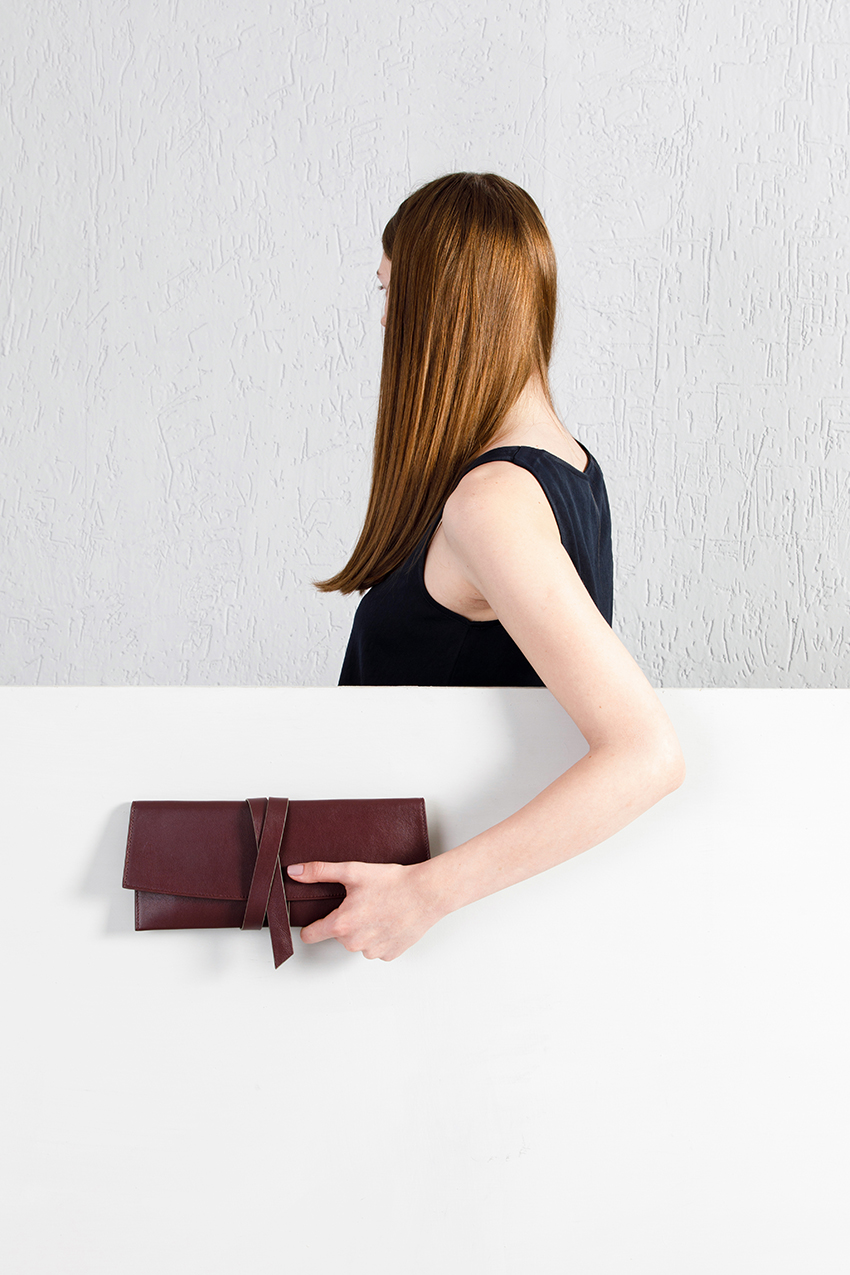
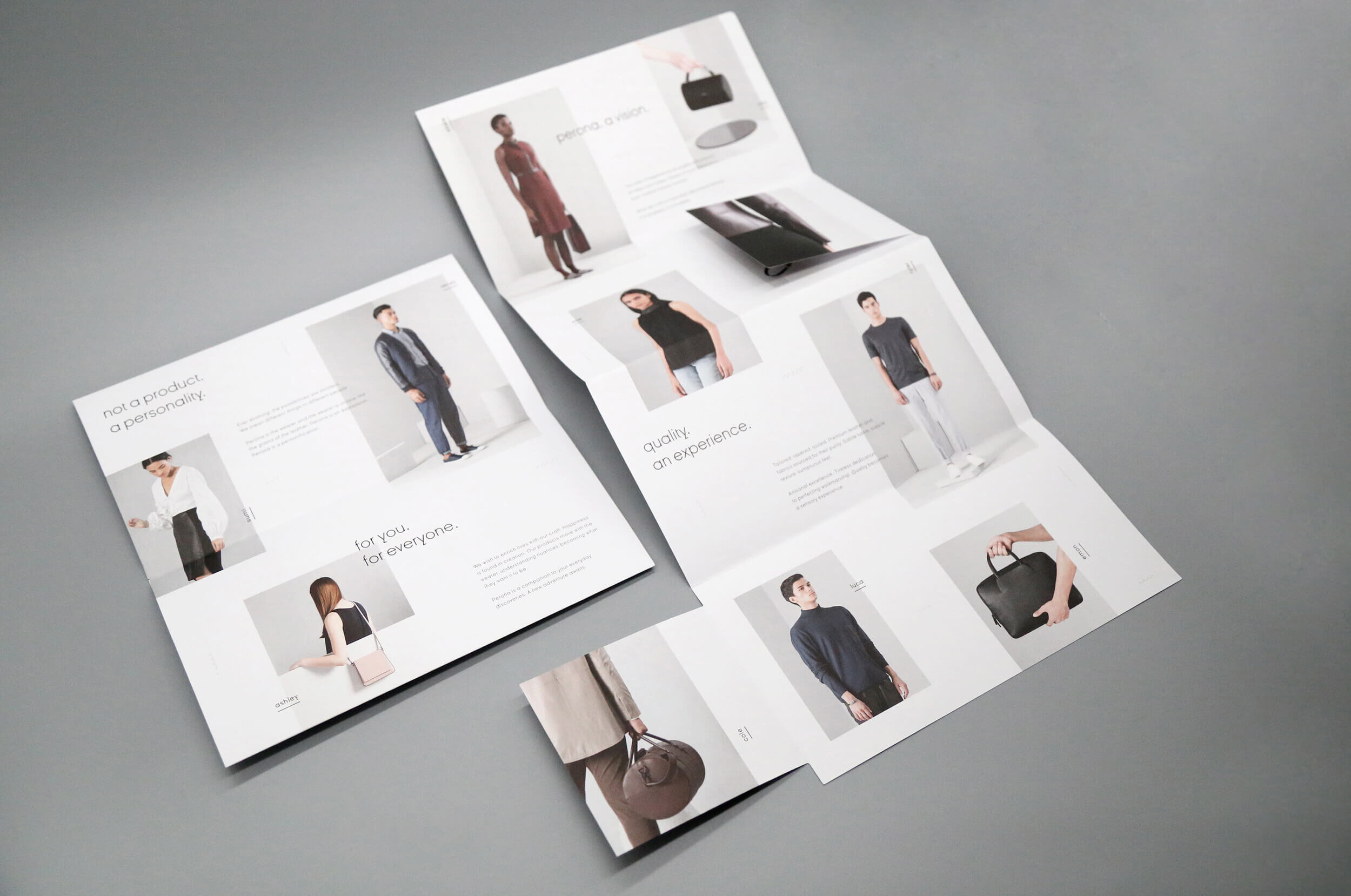
The brand’s imagery and communication also reflects modern minimalism. It’s clean, graphic and modern, that matches the brand’s design philosophy. Although aiming for a minimal aesthetic, it should not get cold, impersonal or basic.
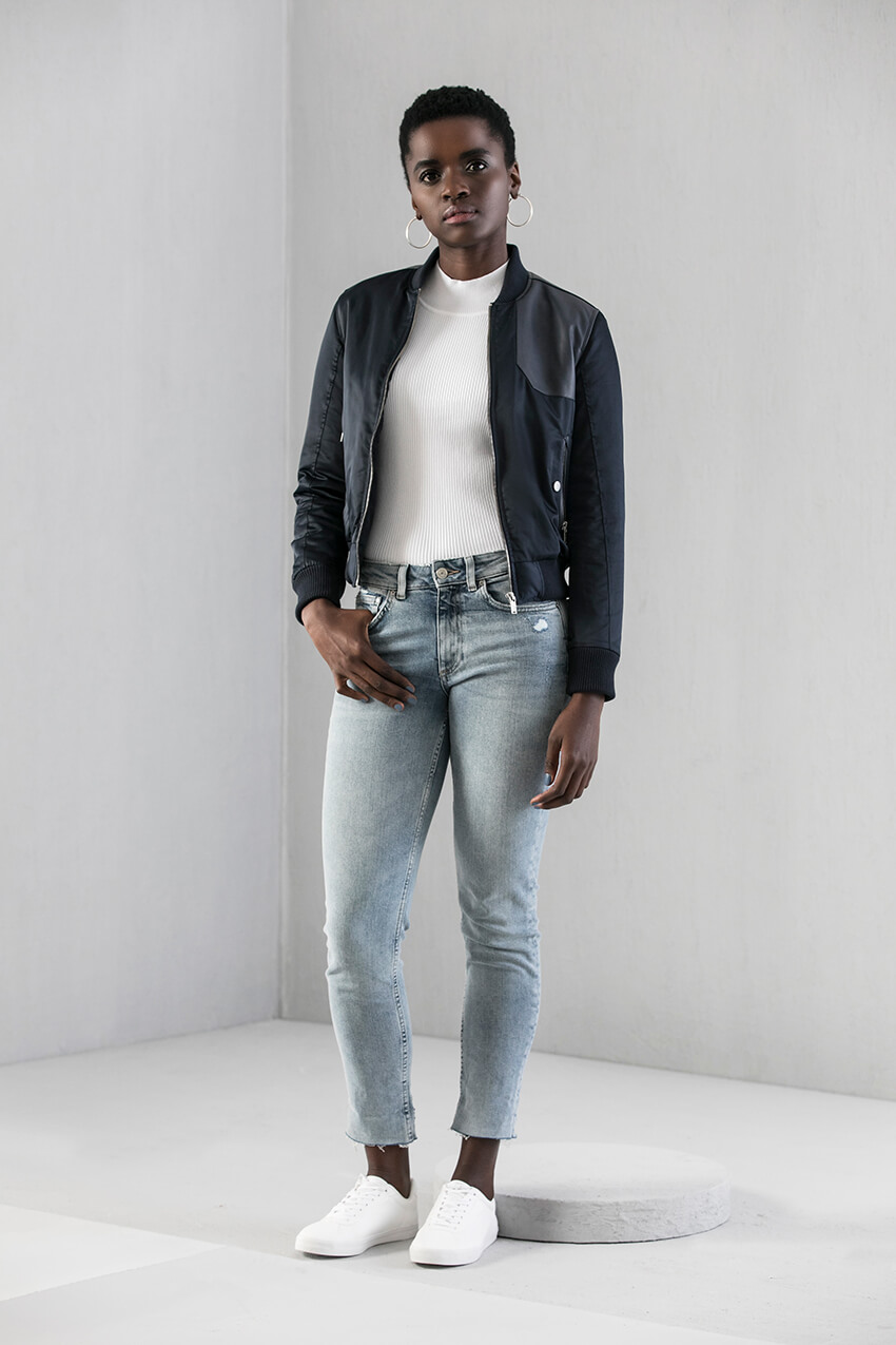
Perona is for everyone. The products are meant to be interpreted differently by different people, based on their style and preferences. The products don’t dictate, they aim to blend seamlessly into people’s lives, as an extension of their personalities. The images reflect different personalities that people can connect with, almost as if it is the brand’s muse. Along with the clean and crisp tone of voice, the imagery will help sewing Perona’s own unique story.
Website
design
The website follows the brand’s philosophy of clean, minimal aesthetic with a modern look and feel. The aim was to find a balance between experimental web design and a user friendly e-com website. Stress was put on using large product imagery, so that while browsing the customers can view the product easily without having to open each product, resulting in multiple tabs.
The products are named using actual names of people, carefully chosen based on their inherent style.


