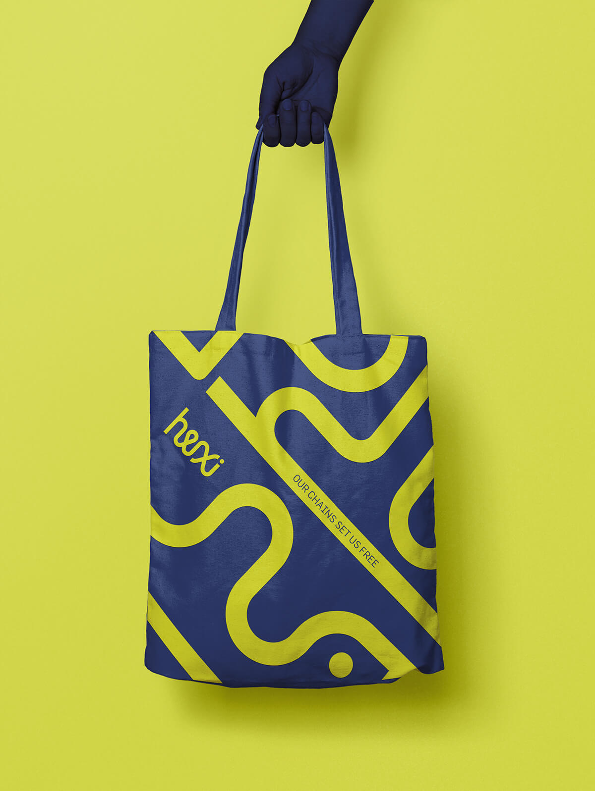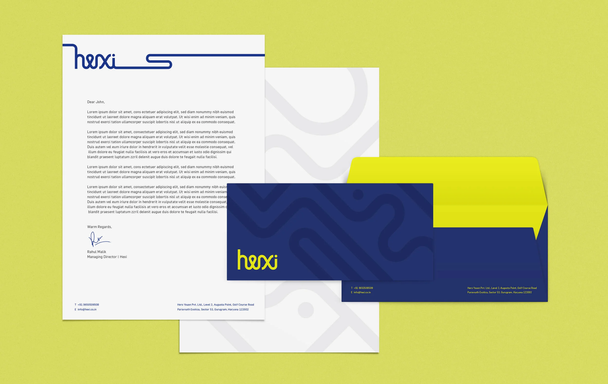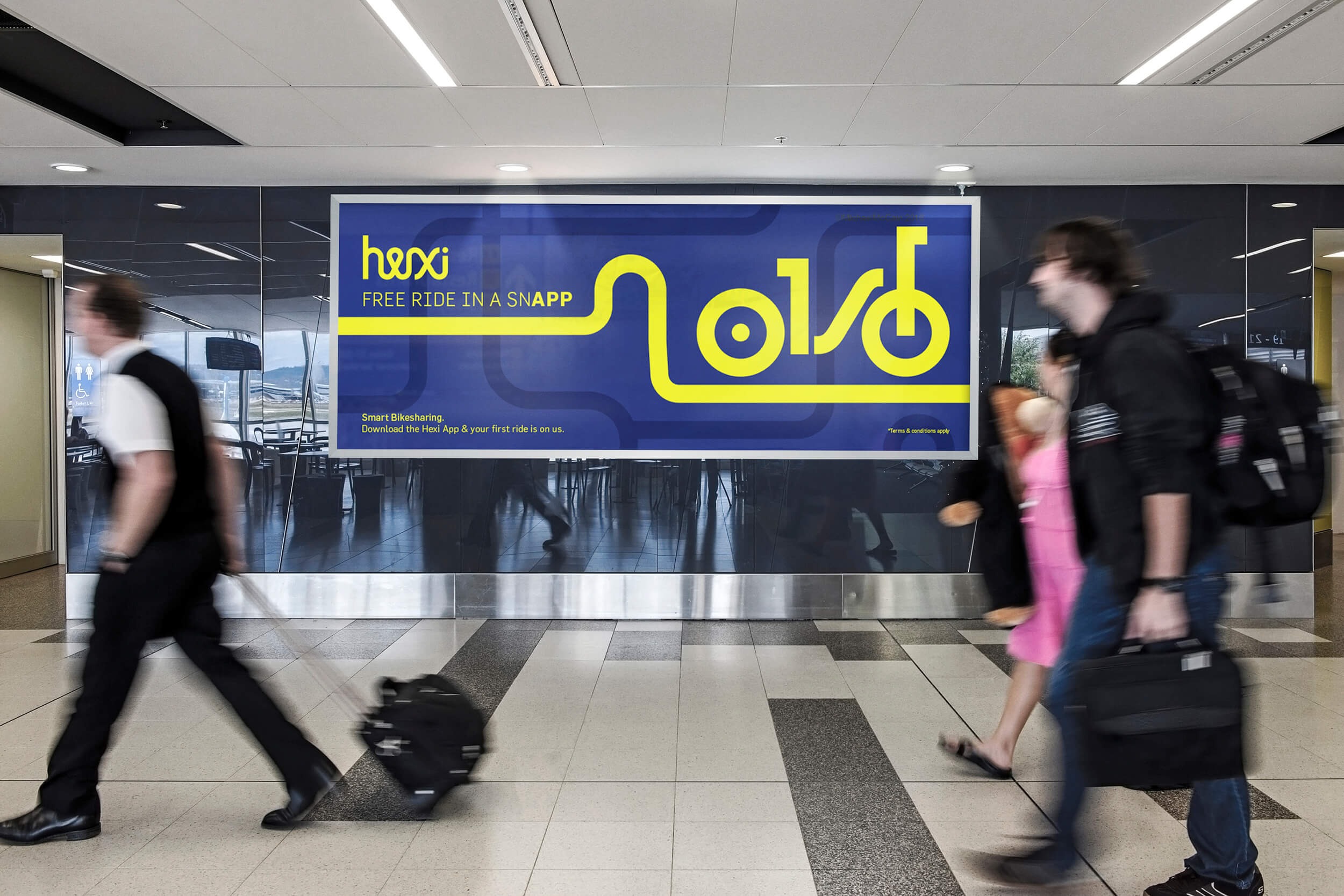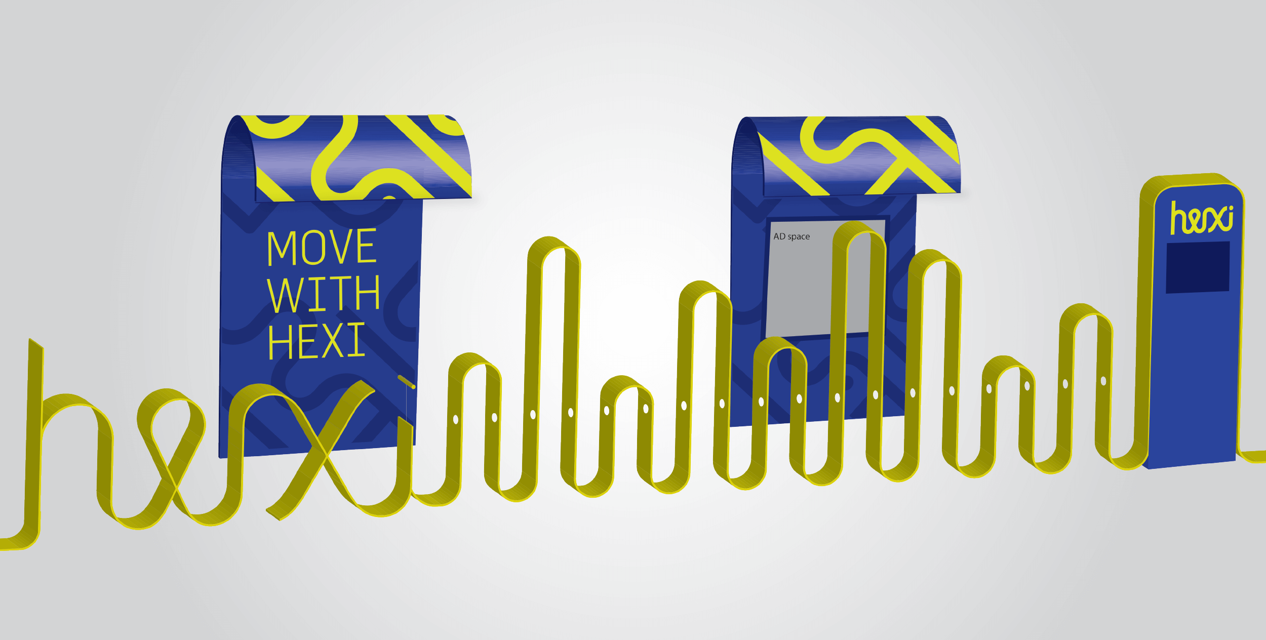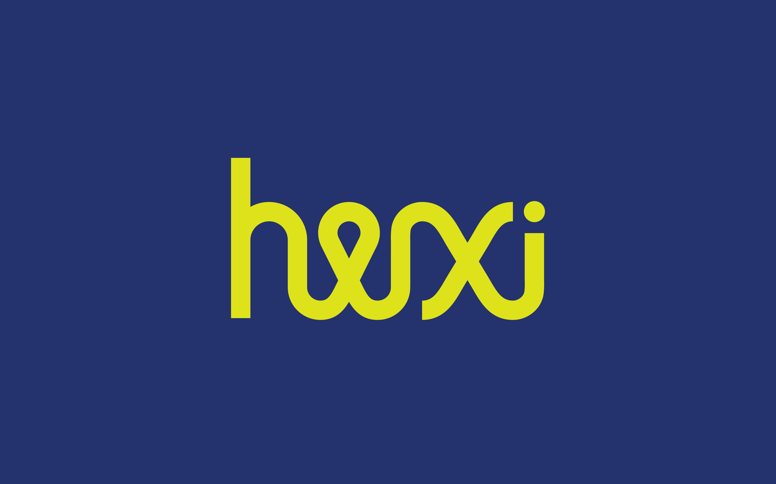

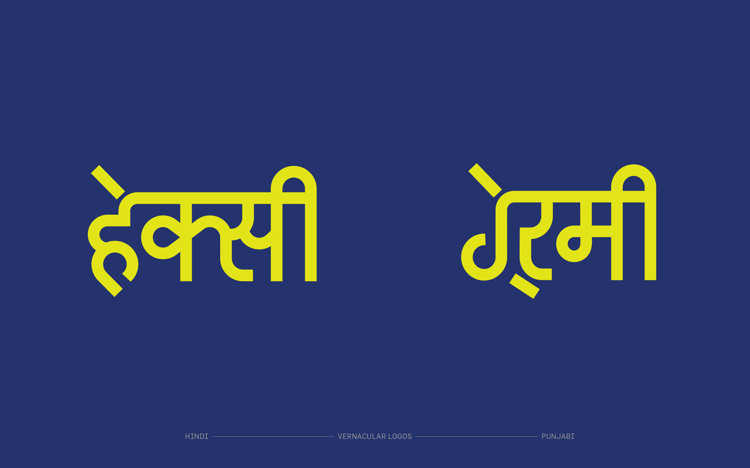
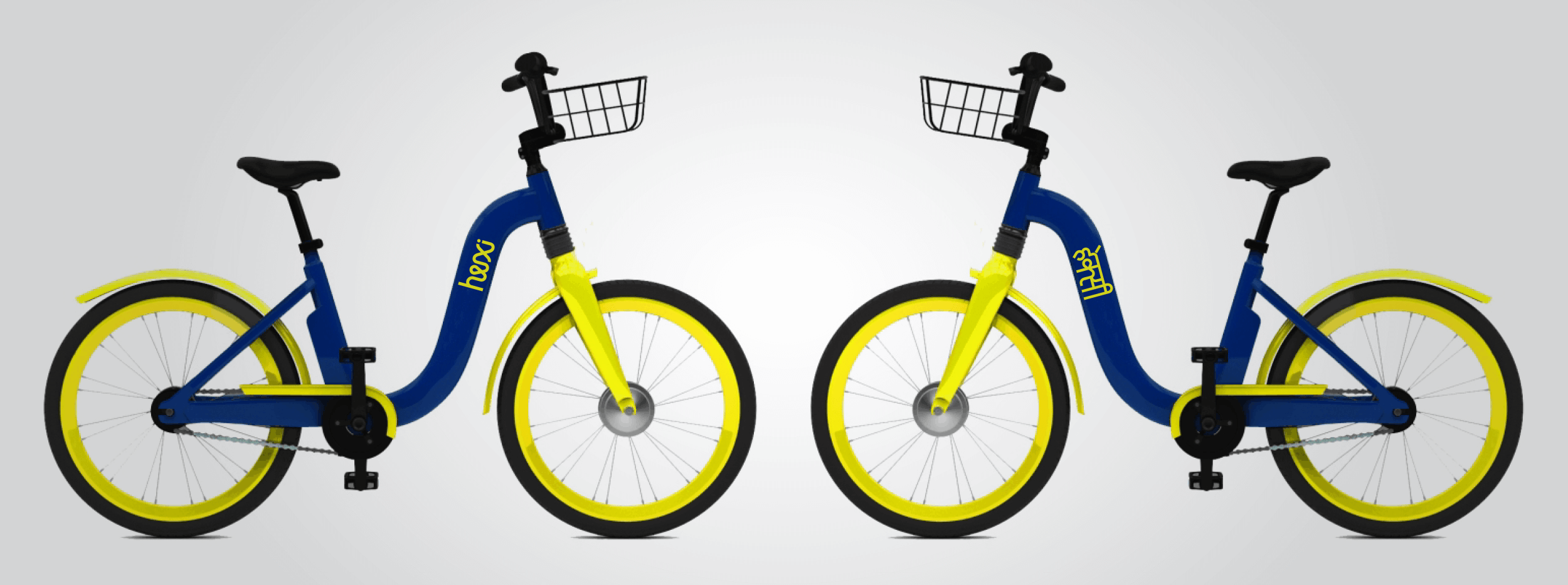

Hexi, is a bike sharing project, by Hero MotoCorp, to enhance personal mobility in cities and to provide convenient first and last mile connectivity. The typography of the word mark embodies this spirit of fluidity and the heaviness of the type resembles roads and connotes reliability. The letter 'e' is a pin, a symbol for destination while the 'x' resembles the down-tube of the Hexi bicycle.
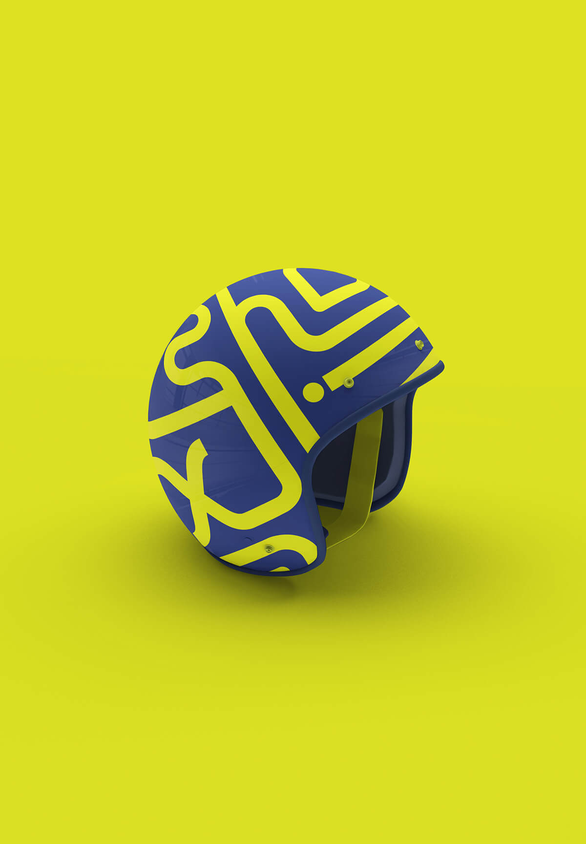
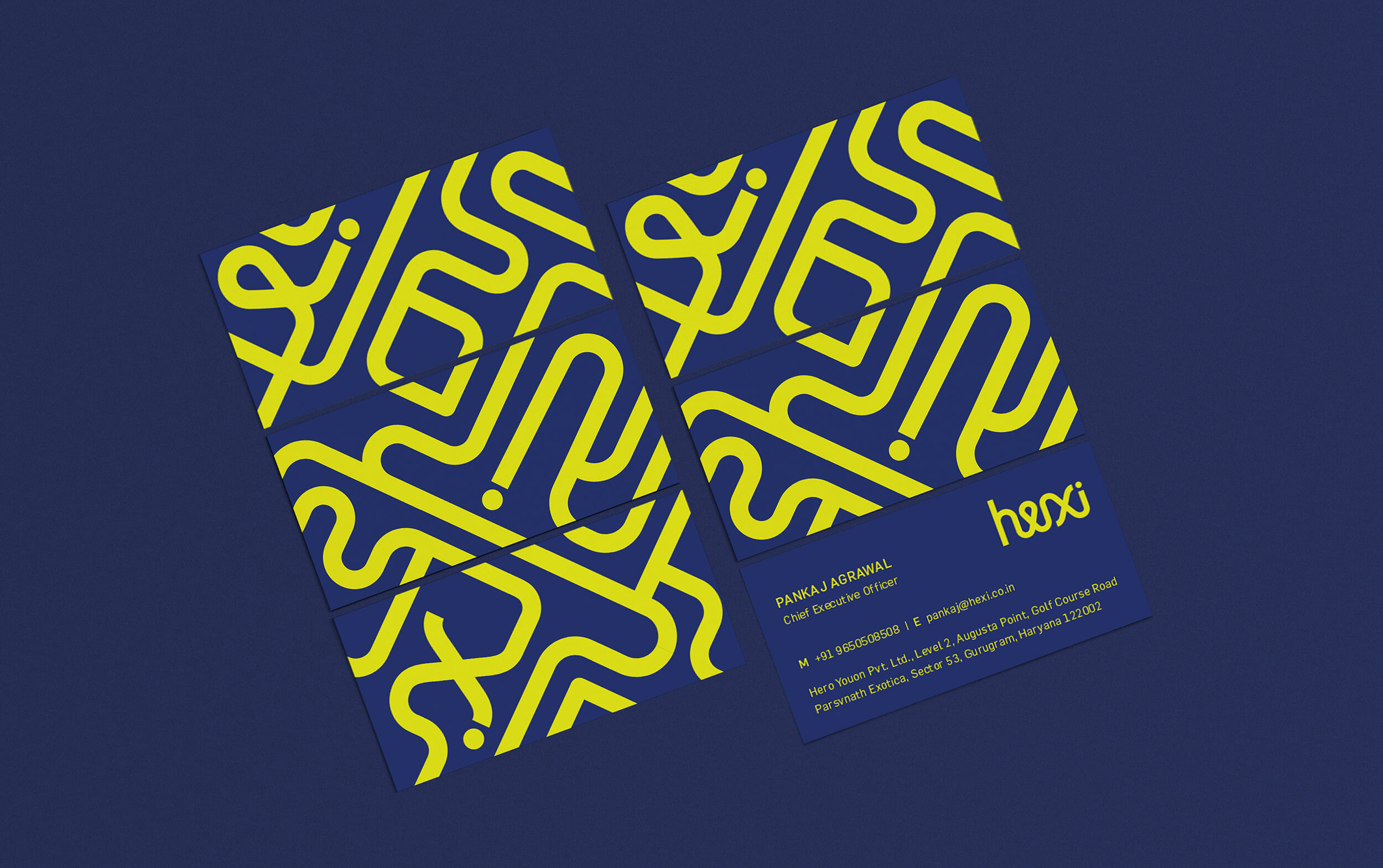
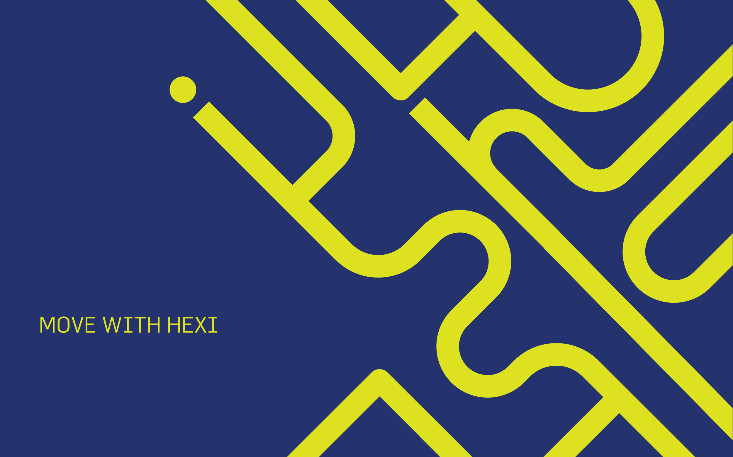
This typography style extends onto the visual language that suggests smooth movement. Along with a witty tone of voice, the entire brand resonates with an element of fun, making it memorable and young.
This project was done while working at Illum Design.
Ride between
the lines